How do we 'read' a photograph?
When looking at photos mostly subconsciously we absorb the picture and take in the hidden message that the photographer is trying to convey within their photograph.This produces a story or meaning through the positioning of their subjects and objects.You distinguish denotative and connotative implications to a photo, denotative being literal and direct such as a written definition or meaning of a certain word and connotative is an indirect feeling or an implied emotion that the photograph accentuates. Within photos there is always the connotative implications and a denotative answer to the photographers viewpoint and story addressing their work.

Identical Twins, Roselle, New Jersey, 1967 |
This photography taken by Diane Arbus of these 'identical' yet not so identical twins creates a rather disturbing feeling for viewers. The differences between the twins such as the denotative details that are obvious such as they are wearing the same clothes and they have similar hair styles, yet the clothes on the twin on the right are slightly straighter along with her hair that is neater . One twin is smiling while the other is frowning makes you think that although they appear the same outwardly, internally they are dissimilar as displayed by their emotions. The angle the photo was taken at is slightly at an angle as the photo was not taken straight on this highlighted by the plain white background and the brick floor.
|
|
This other photograph taken by photographer Diane Arbus provokes a creepy and unusual feeling of this nuclear family. The denotative features of this photo are that there is a family of three and the parents are lying on pool chairs, the dad is covering his face with his hand, there is a swing set and the child is playing in a paddling pool. On the other hand the connotative perspective on this photograph shows that the circle table in the middle could be used to show separation between the parents which draws attention to the theme of isolation and loneliness and even the child is by themselves. The dads positioning shows that he may be embarrassed juxtaposing the wife who appears relaxed however she has a full face of makeup on.
|

A Family On Their Lawn One Sunday in Westchester, New York, 1969 |
Whilst your definitions are accurate, your analysis is too brief. There are overarching issues for both images that you haven't mentioned. You need to (re)read the chapter attached to the task.
The early years
What is the difference between a 'Camera Obscura' and 'Camera Lucida'?
The camera Obscura is a dark box/room that contains a tiny hole that lets light through, the light that's let through is like a projection of the outside world that projects onto the wall opposite. The image is upside down because light travels in straight lines. The camera Lucida was originally used to help artists sketch out objects, it differs from the obscura by the fact that it allows artist sees both subject/scene and drawing surface.

|

|
'Daguerreotype’ and ‘Calotype' differences

The Daguerreotype is the first model of a photograph ever invented in the period of the 1840's and the 1850's.It was a process of making a photograph which Louis Daguerre created which he introduced worldwide in 1839.It is printed onto highly polished silver surface on a copper plate which is sensitised to light by exposing it to iodine fumes.

The Calotype in contrast was the first negative to positive photographic technology which transcends into the camera technology we use today. These negative where created using light sensitive paper coated in silver iodide. This process was first introduced in 1841 by William Henry Fox Talbot. The term calotype comes from the Greek meaning "beautiful", and "impression".
Early photography timeline
You need to complete this. Even if you only include images for the points you have covered.
The Renaissance: Throughout the 16th there was much exploration and portrayal of the reality of nature and how it is portrayed through photography and art which led to increasing popularity.One very well know artist, Leonardo Da Vinci, was known best for his anatomical drawings and his interest in science. An example of this is the Turin Shroud, which looks almost like Jesus however most say is actually a portrait of Da Vinci ; made by covering the cloth with silver salts and exposing it to sunlight.

|

|
Early Inventions: In order to achieve realism, artists had to create various instruments that helped them to gain an image that they may have drawn on to imitate real life features.These started of as the camera obscura, which used a dark room or space, and a small hole of light to create an inverted image onto a blank surface or canvas.
Johann Heinrich Schulze: In 1727, Schulze discovered that a slurry of chalk and nitric acid, with silver dissolved into it, was darkened by sunlight outside. However didn't create a permanently preserved image, but it did help discoveries later on. This is known as capturing shadows.
Louis Jacques Daguerre: Began by fixing the projected image, Daguerre was a painter of stage sets for popular entertainment in Paris.
19th century: In 1927, the scientist Joseph Niepce was successful in fixing the first projected image of the scenery outside his window Le Gras in the south of France. This helps artist get a more accurate depiction of their subject as Niepce was unable to draw well, as he first positioned engravings stones or grass plates coated with a light sensitive varnish of his own composition. He then created the first well known photograph (on metal) in 1826-he called these heliographs.
Pictorealism, Photo-Secession & Straight Photography
1870-1930
Pictorealism

Waterloo place by Leonard Misonne (1899)
|
Pictorealists wanted to embed a beauty within their work, to engage and express attraction in their images really appealing to the viewers rather than fact.
The exploration of the much asked question 'what is pictorealism?' there is a more fundamental question relating to movement : 'is photography art?' This photograph taken by Leonard Misonne (1899) really provokes that question as you take into account the manipulation and several complex processes within the dark room to emulate this end result. |
Impressionism
|
The invention of the camera made it, so Artists would've no longer need to depict the word in a realist way, where impressionists focused on the changing aspects of light, environment and atmosphere. In 1874, French impressionists held first group exhibition.
|

Impression, Sunrise Claude Monet, 1872
|
Photo secession

The Net Mender, Stieglitz, 1894
|
The movement was founded by Stieglitz in 1902, early 20th century. It had the ideals of pictorialism but concerned photographers yet also wanted to be apparent. It also promoted photography as fine art.
-the photography 'movement began' in New York, he wanted mechanical origins to be apparent as well as the ideals of pictorialism. |
Straight photography
|
Straight photography puts emphasis on the cameras own technical capability to produce images sharp in focus and rich in detail.
The term generally refers to photographs that are not manipulated, either in the taking of the image or by darkroom or digital processes, but sharply depict the scene or subject as the camera sees it. |

“Wall Street, New York”, Paul Strand, 1915
|
f/64

|
This group is founded by 7 20th century san Francisco bay area photographers that shared similar styles of photography. They use sharply focus and carefully framed.
|
Image Analysis : Herbert Bayer
Herbert Bayer (1900-1985) is one of the individuals most closely identified with the famous Bauhaus program in Weimar, Germany. Together with Walter Gropius, Laszlo Moholy-Nagy, and Wassily Kandinsky, Bayer helped shape a philosophy of functional design that extended across disciplines ranging from architecture to typography and graphic design. Endowed with enormous talent and energy, Bayer went on to produce an impressive body of work, including freelance graphics commissions, Modernist exhibition design, corporate identity programs, and architecture and environmental design.
‘Lonely Metropolitan’ - 1932
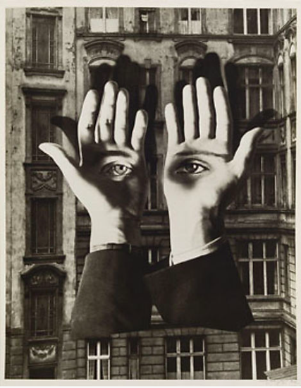
Lonely Metropolitan by Herbert Bayer is a photo collage which represents the personal effects of moving to the city. Bayer experienced feelings of claustrophobia, insecurities, loneliness and isolation which is portrayed in this image. The photograph was supposedly taken from a balcony similar to the ones that are apparent in the picture. The closeness of the windows and the height of the building give them impression of claustrophobia due to cramped and confined living conditions, with people literally living on to top of each other. There seems to be little privacy and the windows and building appears to be rather dark,hostile and unwelcoming. The montaged hands are not connected to a body, could reflect the detachment one feels from the city. The eyes on the hands are from different people, this, as well as the floating hands could suggest that the person of which this is a viewpoint is anonymous, expressing the idea that this detachment is a collective feeling, applying to all those who have moved to the city.He used the palms of hands as a metaphor almost being eyes
The techniques in which Bayer uses within his montage
I believe that Bayer purposefully intended to convey an intentional message within the Lonely Metropolitan such as this theme of not belonging or trying to feel comfortable in a new experience. The mood of isolation is conveyed by the dark tones and seclusion of the hands by themselves placed on a Berlin building facade, the title 'lonely metropolitan' also alludes to this theme of desolation and loneliness. The montage was made in 1932, Bayer was influenced by surrealism. Surrealism was a movement in the art world that emerged after World War I.
Artist presentation
Well formatted, a really thoughtful presentation. Complex concepts were clearly communicated and your research had depth. Your presentation of Kasten's technique was particularly interesting and you. made intelligent connections to modernist movements.
Grade: A
Grade: A
Documentary photography hero
Dorathea Lange
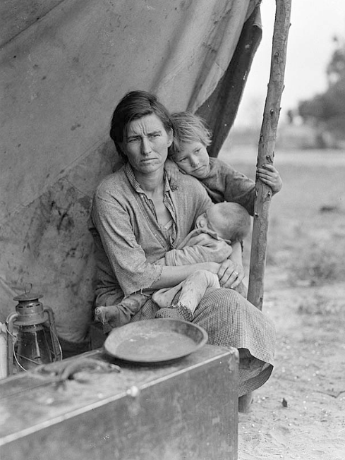
Dorathea Lange was a documentary photographer and photojournalist born in America on the 26th of may, 1895.Lange was a photographer for about 15 years making a living off taking portraits of the san Fransisco elite, although after the great depression hit she left her studio in order to document the consequences of the crisis using residents of the city.When her photographs where published Roy Stryker (manager of fsa) hired her to work for the government.He employed her on the basis to take on the project of documenting poor rural workers in order to raise awareness as a political stance to support for government aid.

After her work she was on her way home when she came across a pea pickers camp a saying for poor people who migrated west in search for work during the depression.Due to the crops freezing work was stopped leaving the employees helpless and starving .
Lange stopped by and using her 4x5 graflex took a series of photographs camera containing one of her most moving and iconic photographs being the 'migrant mother'.Depicted in this photograph is an impoverished family (known as the Thompson family) huddled under a tent.
She was instantly drawn to the family like 'a magnet'.She took various test shots before her sixth photograph 'migrant mother'.The children's faces are turned away to evoke sympathy while the viewer is drawn to the mothers distressed face as her hand rests on her chin almost as if it's an arrow accentuating the power of the image.
Lange had a dark room assistant manipulate the image by removing the women's thumb that wraps around the post to avoid distraction from the message that the photo alludes to.However the modification does take away the genuine purpose of documentary photos yet it doesn't neglect Lange's cause as her influential picture emphasised the difficulty many migrants faced during that tragic era.
'Migrant mother', 1936
I chose Dorathea Lange as my hero as her photograph 'migrant mother' perfectly encapsulates the suffering of many migrants and the publication of her picture gained awareness of their position which gravitated toward the £20,000 donation given by the government to the migrant camp, proving the evocation of her image.


|
|
A clear summary of the context to Lange and this series. Good reasons for your choice however, do you have any issues with the way Lange manipulated the scene?
Documentary 2
|
|

City Fathers, Hoboken, New Jersey, 1955-6

|
Los Angeles 1955-5 City Fathers, Hoboken, New Jersey 1955-6
Something captured in a photograph can still be described as mysterious as shown as Robert Frank where there is this hidden meaning within a photo where he captures some one walking the same direction as an neon lit up arrow directs him to one direction potentially implying Americans complying to social norms and rules without questioning reasons behind it
Photographs don't create reality they document as most photographs are only instant shots that can be angled or manipulated to appear like something else .They change relationships with things as different details and angles of looking at a picture can change a persons perception and the concept the photographers trying to address. In a lot of Robert Franks work in America
Is this complete? Some interesting responses beginning to emerge.
Framing
|

|
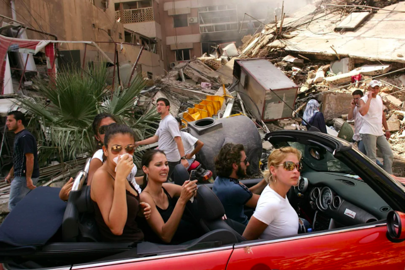
winner of the world press photo by Spencer Platt (Getty images 2006) four deaths (1974)
|

|
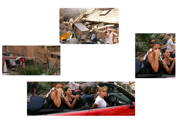
We cropped the image into different segments in response to Hilliards work as shown above to showing the different ambiguous interpretations of a selection of photos that are all married to one.Hilliard showed the same image cropped in four different ways in four different photographs, each with the printed titles.
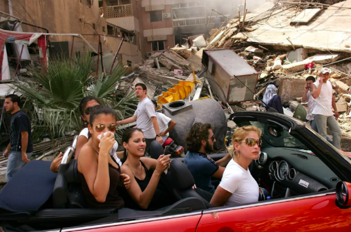
My interpretation of the photograph did change when I found out the context of the people and the car.The media did amplify the picture and didn't educate people about the depth of the photo yet only highlights the untruthfulness.
'it makes you wonder how truthful a picture can be' |
Spencer Platt was awarded a prize in the prestigious world press photo awards.The awards however, sparked a debate in Lebanon.The picture shows this glamorous soft top red car with people almost shown as unaware of their surroundings amidst the chaos of the destruction behind them depicting them as inattentive rich kind with little to care about.
Spencer Platt took his picture on the 15th of August ,which was the day after the southern suburbs of Beirut ceasefire.The ceasefire led thousands of people fleeing to their homes they had fled during the Israeli shelling.The caption of the original photo was 'affluent Lebanese drive down the street to look at a destroyed neighbourhood'.This picture was picked up by many magazines and newspapers around the world.Some were horrified it won such a prestigious prize because of what it alluded about their country and some criticised it saying it lacked context as it was only a snapshot, without much depth or great comprehension.This photo does challenge perception and how a victim is perceived. However the people in the photograph where actually residents of the area and had to flee during the shelling, they returned to the suburbs to check on their apartment and belongings .The car that was driven 'isnt just a trendy, tourist car it played a big role in the war' it was used to deliver medication to refugees who had taken shelting in the schools of Beirut' |
Your writing is always succinct and to the point. A clear introduction to the task and thoughtful insights made about the image itself. However, you haven't answered the question, Photography is an art of selection rather than invention, discuss.
Comparison- Landscape Photographers : Fenton and Prince
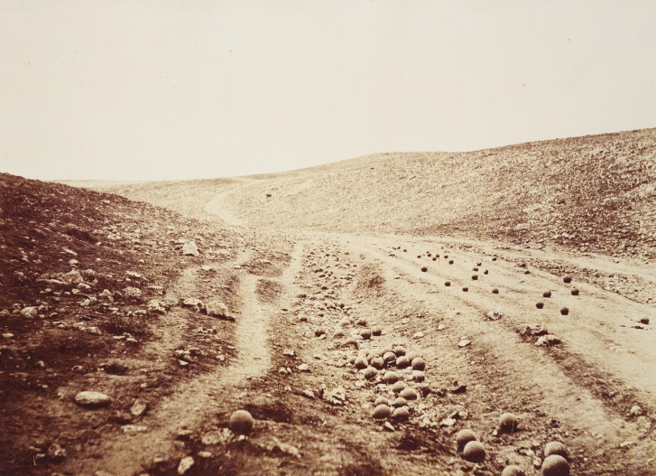
Roger Fenton , "The valley of the shadow death" -1855
Fentons 'The valley of the shadow death' was taken on April the 23rd, 1955 during the crimean war, it illustrates a barren and neglected landscape.Fentons picture was part of a series of many that he took when he was in Crimea, contributing to some of the first few war photographs.To avoid offending a Victorian audience, Fenton withheld from photographing the dead and wounded and instead photographed a scattering of canon balls which have the appearance of rocks. Photographic researchers and Historians claimed to had believed that the more recently discovered picture is thought to be the first, indicating that Fenton may have been one of the earliest to stage a news photograph.Fenton had manipulated and placed the scattered cannonballs, the idea of truth and honesty to the photograph, completely contradicts itself.
|

|
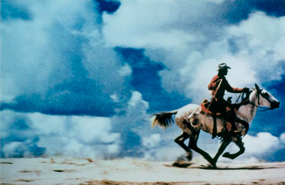
Richard Prince untitled (cowboy) 1989
Prince's 'untitled' (cowboy) photograph depicts a cowboy that stands out against a vivid blue background of a sky.Price utilises magazine advertisement as his focal point, his work both reflects and critiques American culture.He became widely known through his appropriation and manipulation of images.The photo depicted below of the lonesome cowboy was taken by photographer Jim Brady, as a campaign advertisement for Marlboro (a cigarette company).Many believed that what he did was very controversial and that some would even say that he's making money out of other peoples art.
|

|
Conclusion
Similarities drawn by both of these Artists surround the idea of predominately manipulation.Although both appearances of the images contrast the manner in which they adapted the scenery of the photographs are similar.Fenton stages a news photograph as his photo subverts from the truth and Prince uses an advertisement photograph without the writing.However they juxtapose each other as Prince's centres around the concept of appropriation as he also didn't use his own photograph where as Fentons photograph is his own.
Well done! You have answered the brief and discussed the key points about manipulation and 'truth'.
Exhibition visit- A world in common- Tate modern
For one of my gallery visits I went to the Tate modern and was immersed with the A word in common exhibition. The exhibition celebrates the varied landscape of contemporary African photography.
V and A - Photography centre
Exhibition - NPG Eyes of the storm
This exhibition reveals photographs taken by Paul McCartney while he using his own camera in the period between 1963 and 1964. The Beatles are easily one of the most globally influential bands. The exhibition showcased never seen before photographs showing the perspective of a 'Beatle' at the beginning of 'Beatlemania' –Paul McCartney’s photographs document a new perspective on the story of a band creating cultural history.
The work was organised in the gallery by the different cities they toured in. To intrigue and add interest to the exhibition they used a range of different sizes of photos and contact sheets, using magazines and streets and music..
Highlighted pieces
The work was organised in the gallery by the different cities they toured in. To intrigue and add interest to the exhibition they used a range of different sizes of photos and contact sheets, using magazines and streets and music..
Highlighted pieces
