
|
Transformation is an overarching theme in photography as it captures the essence of change. Through a lens, I'm mostly interested in the subject of portraiture and people as illustrated by the artists I chose for my strands. Exploring transformation through photography gives way to opinions and inspires viewers to reflect on their own experiences of change. I'm fascinated by transforming a photograph and the story and influences behind it. I specifically focused on changing appearance.
|
Definition:
transformation 1. a marked change in form, nature, or appearance. 2. a process by which one figure, expression, or function is converted into another one of similar value. |
Strand 1 - MAURIZIO ANZERI

|

|

|
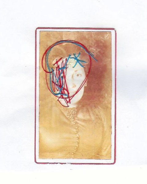
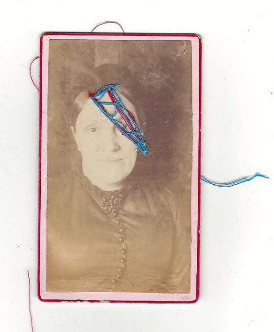
Maurizio Anzeri creates his portraits by sewing directly into vintage portraits found in flea markets and junk shops found photographs adding his own personal twist. He embroiders abstract hand stitched patterns, into the photographs, using coloured threads which juxtapose the neutral grey tones of the old photographs. He overlaps his lines, circles almost developing a mask for the portrait, disguising the identity of the subject, transforming the photograph into modern pieces of art. His opinion of the images is that they are 'landscapes on which to map out my own unique geography of suggestion'. His fascination for photographs developed through the manipulation of them he had attempted to draw over photographs, however articulated that 'Drawing will never do what a thread does'.
'I work with sewing, embroidery and drawing to explore the essence of signs in their physical manifestation. I take inspiration from my own personal experience and observation of how, in other cultures, bodies themselves are treated as living graphic symbols.'
'I work with sewing, embroidery and drawing to explore the essence of signs in their physical manifestation. I take inspiration from my own personal experience and observation of how, in other cultures, bodies themselves are treated as living graphic symbols.'
|

|
|

|

|

|
I feel these edits respond appropriately in response Maurizio Anzeri. I think the stitches work well in distorting the vintage photographs. I purposefully picked vibrant colours to juxtapose the dull grey and yellow tones of the photographs. The thread of the red and blue almost act as arteries and veins. I think these would have worked better if I transferred the images onto a fabric as it would have made it easier to sew onto the fabric as sewing onto paper was quite temperamental and difficult.
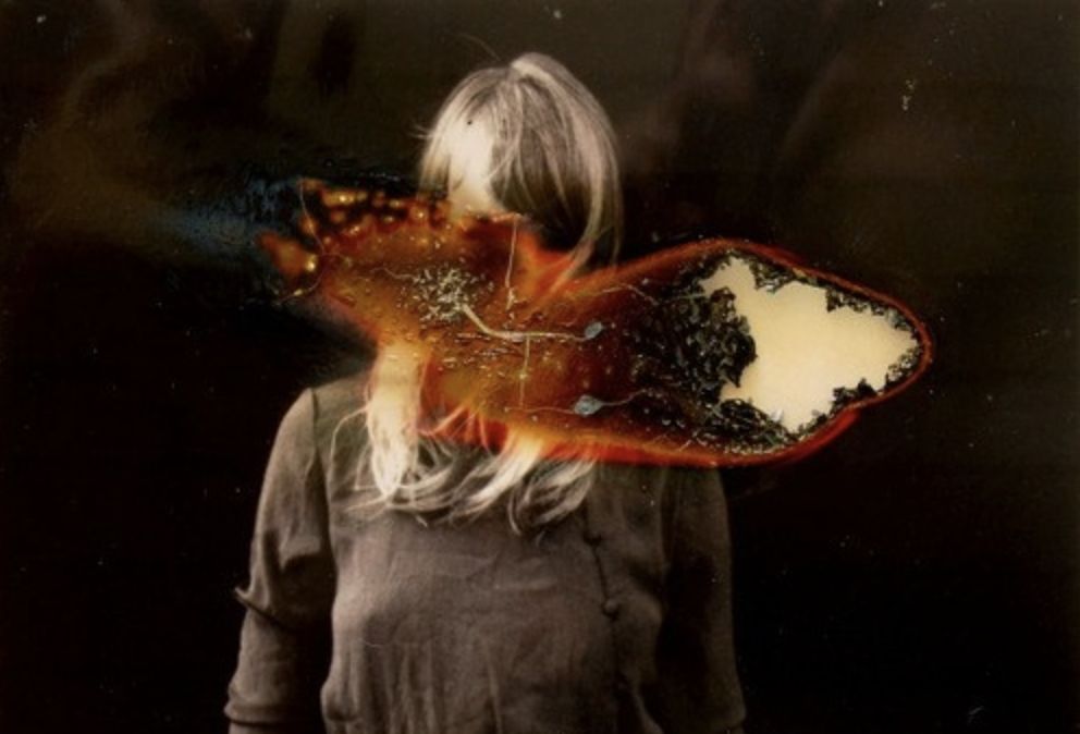
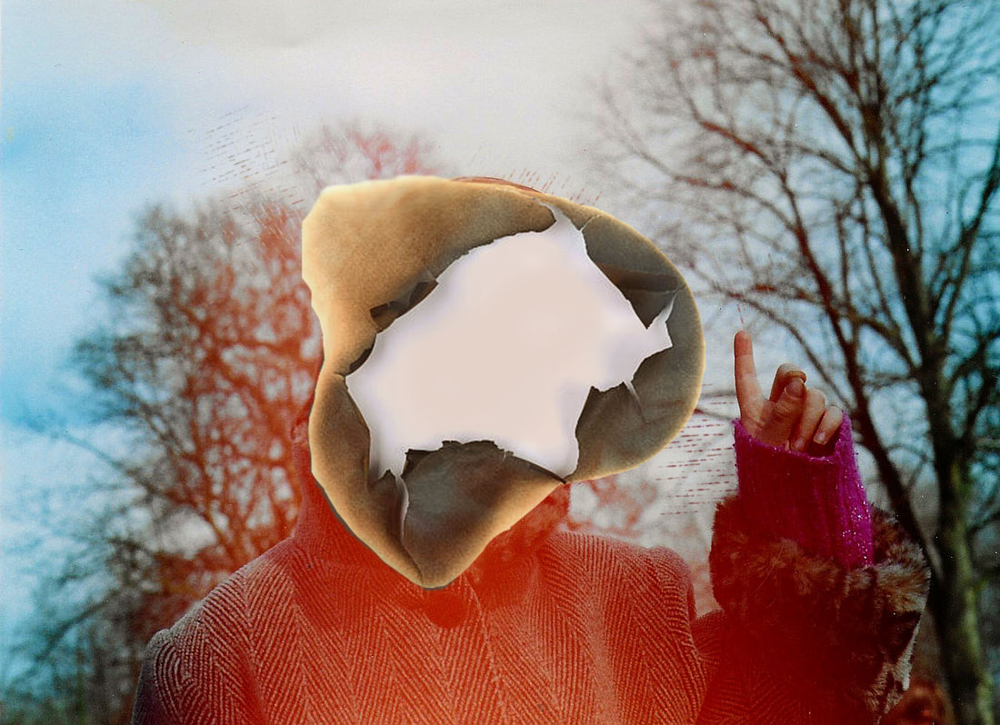
Strand 2 - LUCAS SIMOES
|

|
|
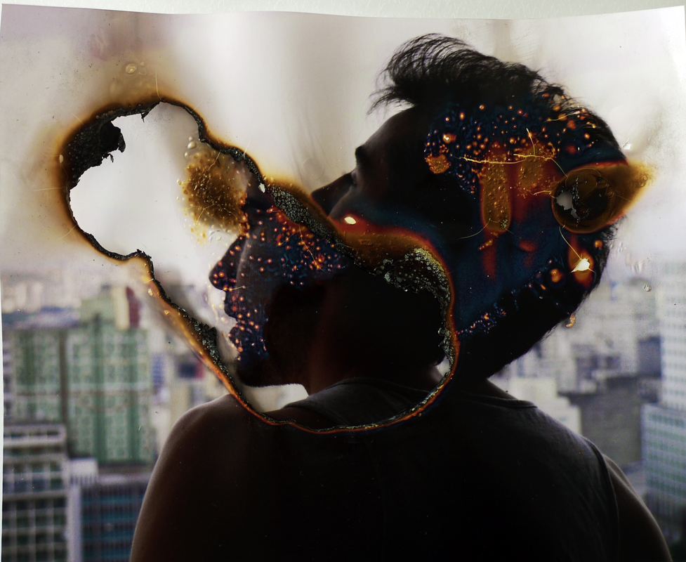
Simões uses source materials such as maps, books and photographs, which he then folds, cuts and deconstructs into new forms. ‘In my work’, he explains, ’the materiality of the supporting medium is important. The process of making the support a part of the work is achieved through the experiences it is subjected to, such as burning, cutting, distorting or diluting, which, at its most extreme, can destroy the subject.’ Simões burns photographic portraits, to give them such personality that their remains sometimes come across as grotesque three-headed beasts (ausência series) and sometimes remind us of sparking memories of the past
My interpretation:
|

|

|

|
Overall, my efforts when digitally burning the photographs I was aiming to position the burn over the face of people who have less involvement in my life to make it more personal. I feel that it responds effectively to Lucas Simeos and how my interpretation contrasts as I edited my photographs digitally.
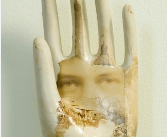
Strand 3 - JAMES MICHAEL STARR
James Michael Starr uses random objects and creates his own collage on them as shown on his Steel and wood trowel, photographic print where he used his fathers portrait.
'I find the aged and battered objects commonly employed in assemblage and collage to be both beautiful and moving, but am weary of their tendency, as art mediums, to take themselves so seriously. I hope to tweak that sombreness and agenda, and make works that are more accessible, by evoking frivolous imagery from our collective consciousness'. The way Starr applies his photograph to the object is seamless and appears as if its ageing with the object. My intention is to recreate this theme of transforming something with artificial aging e.g editing my photographs in a certain way in photoshop and staining the prints with coffee and tearing them before applying the portraits to the specific garden objects. I took the photographs using artificial studio lighting and then edited them on photoshop to appear like daguerreotype photographs.
'I find the aged and battered objects commonly employed in assemblage and collage to be both beautiful and moving, but am weary of their tendency, as art mediums, to take themselves so seriously. I hope to tweak that sombreness and agenda, and make works that are more accessible, by evoking frivolous imagery from our collective consciousness'. The way Starr applies his photograph to the object is seamless and appears as if its ageing with the object. My intention is to recreate this theme of transforming something with artificial aging e.g editing my photographs in a certain way in photoshop and staining the prints with coffee and tearing them before applying the portraits to the specific garden objects. I took the photographs using artificial studio lighting and then edited them on photoshop to appear like daguerreotype photographs.
|

|
unedited photographs:
editing process:
Daguerreotype edits:

|

|
I'm satisfied with the editing process which led to the turnout of these photographs. I thought they looked effective when pasted onto the objects as they show another dimension of transformation. They link to the transformation of ageing and by editing them on photoshop they appear like an 1850s photograph. The daguerreotype editing style of the photographs adds to the aged look of the prints.
edits:

|

|

|
To achieve this result I printed out the daguerreotype edit photographs onto paper and cut and ripped them. I stuck them onto random objects as shown above such as the trowel, plant pot and stump of wood. I ripped up the portraits and then stuck them onto the object by using pva glue and to discolour the whiteness of the ripped paper I dampened it with a small amount of coffee using a paint brush. I attempted to blend the boundaries between art and photography. My favourite prop used was probably either the tree trunk or the spade as they are the most suiting and the lighting was best in both photographs. I think that it works well and I'm satisfied with the finished products however, next time what I would do to improve would be to give them all a cohesive background so they appear in the same series. To improve the potential next set of edits I
Development
Walead Beshty
|

|
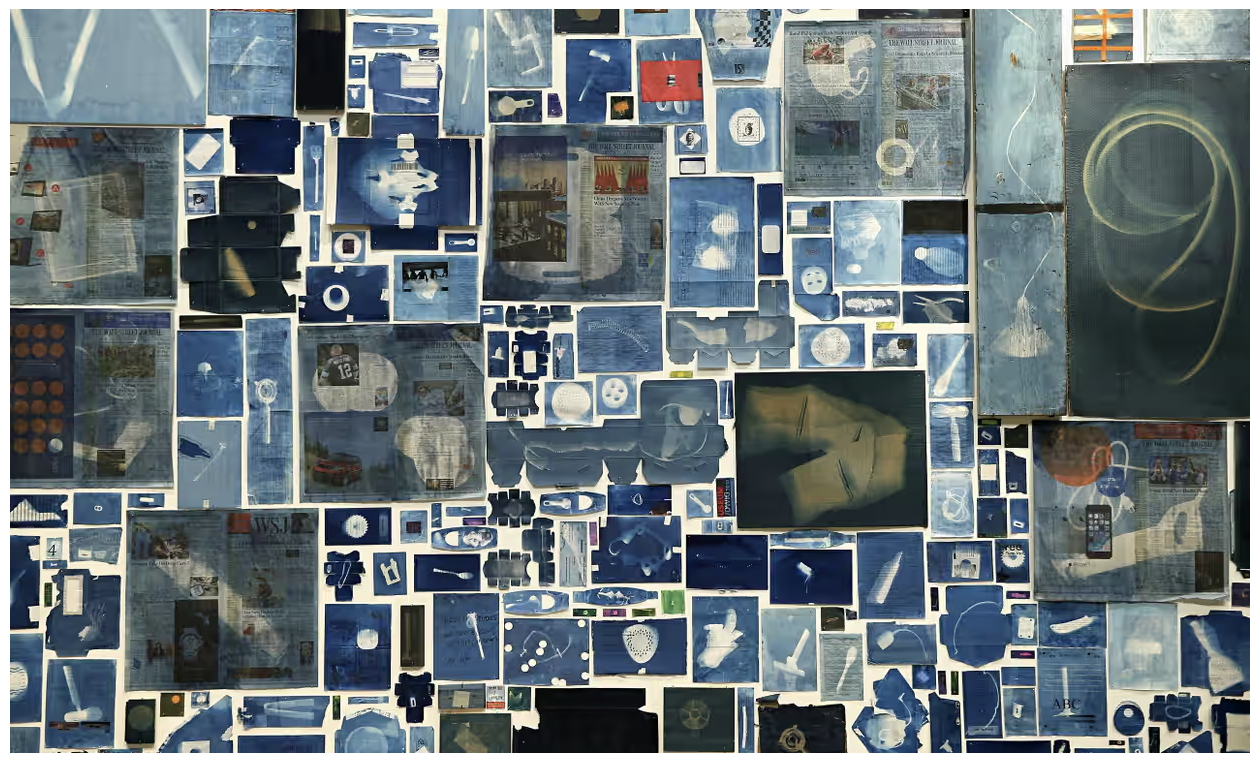
UK-born, LA-based artist Walead Beshty displayed his artwork at the Barbican's concert hall is a massive collage. Using over 12,000 prints collected over a year, Beshty assembled them using the early photographic technique: cyanotype. The pieces include old newspapers, concert tickets, and various discarded items, form silhouettes of white against a cyan blue background. Beshty sees the work not just as a reflection of his year, but as a culmination of his artistic endeavours.
The collage, spans around 90 meters along the hall's Curve space, incorporating waste from Beshty's studio and personal objects alongside newspaper clippings, reflecting his preference for physical newspapers over digital ones. Titled "A Partial Disassembling of an Invention Without a Future: Helter-Skelter and Random Notes in Which the Pulleys and Cogwheels Are Lying Around at Random All Over the Workbench," the artwork tells its own story, inviting viewers to interpret its narratives. Beshty describes it as a testament to the tangible allure of objects and the many different meanings embedded within them.
The collage, spans around 90 meters along the hall's Curve space, incorporating waste from Beshty's studio and personal objects alongside newspaper clippings, reflecting his preference for physical newspapers over digital ones. Titled "A Partial Disassembling of an Invention Without a Future: Helter-Skelter and Random Notes in Which the Pulleys and Cogwheels Are Lying Around at Random All Over the Workbench," the artwork tells its own story, inviting viewers to interpret its narratives. Beshty describes it as a testament to the tangible allure of objects and the many different meanings embedded within them.
My interpretation:


|


|
The technique was invented in 1841 by Sir JohnHerschel and was popularised by photographer and botanist Anna Atkins. In my response as shown above, I chose to use plants from my cyanotype prints. For the cyanotype process, I used cyanotype light sensitive paper. I positioned the plants on the paper how I wanted them to translate onto the paper. I chose plants which has different shapes which I thought would appear interesting on the paper. I left them in direct sunlight for around 20 minutes. I then took the sheets of paper and placed them in a wide bowl of water. The water inverts the prints and fixes them. The deep Prussian blue is created once exposed to water for around of water. The slight smoke like and blurriness of the plants is created through slight movement, so next time to improve I would place clear, weighted glass over the top to keep them still to prevent the double exposure. Maybe to improve this and make them more interesting I could have cut them into different shapes other than have a plain square.
Development
Lumen prints

|

|

|
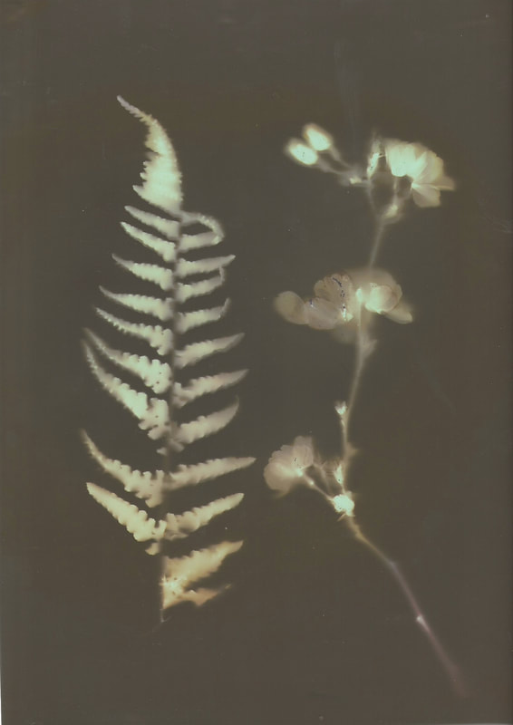
Photographic lumen prints are a photographic process that involves creating prints using light-sensitive materials, such as photographic paper, without the use of a camera or traditional negatives. The process involves placing objects directly onto light-sensitive paper and exposing them to a source of light. Depending on the type of paper you use, you will achieve different colours, if you place your print in a dark room chemical 'fix' which removes the colour and gives it an interesting contrast look, as shown in the top far right print.
my interpretation:

|

|

|
|
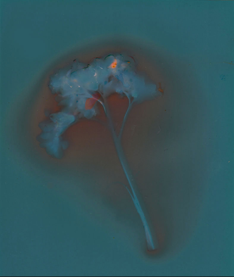
Lumen prints produce unpredictable results and often have a unique, ethereal quality to them. They can capture the transformation of objects over time as they interact with light, creating visually striking and often abstract images. The silhouette of the plant really stands out and the blue and pink colours really suit and contrast each other.
These lumen prints I created by placing plants on a variation of coloured light-sensitive photographic paper. I left my prints in a light-expose
d box for over 3 hours. The ones that were left on the blue light-sensitive paper left light blue markings with dark pink outlines. The other paper which was dark left paler blue tones which juxtapose the dark purple tones. The colours that came out blend well together
d box for over 3 hours. The ones that were left on the blue light-sensitive paper left light blue markings with dark pink outlines. The other paper which was dark left paler blue tones which juxtapose the dark purple tones. The colours that came out blend well together
Development
Prints soaked in fix (sodium or ammonium thiosulfate) :
|

|

|
The discolouration of lumen prints when exposed to fixer is a process influenced by various factors such as the specific materials used in the print, the composition of the fixer solution, and the type of paper. The extent of discolouration can vary greatly depending on these factors and may result in unpredictable effects. However, with my lumen prints the last two lost their attractive blue and pink colours and they were left with a mix of grey tones which don't stand out as much as the colourful prints. The first one is my favourite, you can't see in the digital photography but with the physical print the area where the leaf covered turned see-through due to the type of photographic paper.
Development
Julia Margaret Cameron
|

|

|
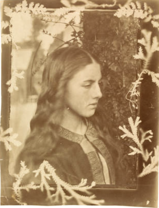
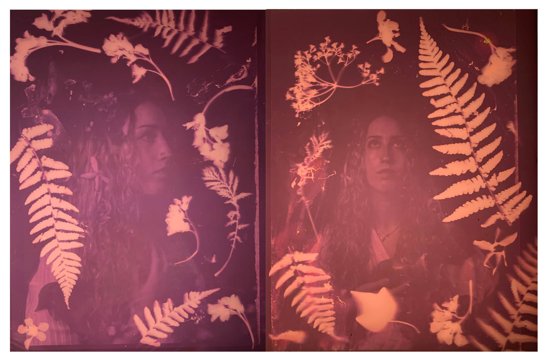
Before then, Cameron had compiled albums and experimented with printing photographs from negatives. On one occasion she printed a negative by the pioneering Swedish art photographer O.G. Rejlander, surrounding the portrait with ferns to create a photogram frame – a combination of an image made in a camera and a camera-less technique. It shows Cameron's experimental nature and provides a glimpse of her photographic practice before she acquired a camera of her own. Her luminous, feathery portraits and staged literary or biblical scenes are often grouped with Pre-Raphaelite paintings, which certainly influenced them
She used the most common process at the time, producing albumen prints from wet collodion glass negatives. The process required a glass plate (approximately 12 x 10 inch) to be coated with photosensitive chemicals in a darkroom and exposed in the camera when still damp. The glass negative was then returned to the darkroom to be developed, washed and varnished. Prints were made by placing the negative directly on to sensitised photographic paper and exposing it to sunlight. I admire the beauty and style of Cameron's work and it inspired the style of my portraiture.
She used the most common process at the time, producing albumen prints from wet collodion glass negatives. The process required a glass plate (approximately 12 x 10 inch) to be coated with photosensitive chemicals in a darkroom and exposed in the camera when still damp. The glass negative was then returned to the darkroom to be developed, washed and varnished. Prints were made by placing the negative directly on to sensitised photographic paper and exposing it to sunlight. I admire the beauty and style of Cameron's work and it inspired the style of my portraiture.
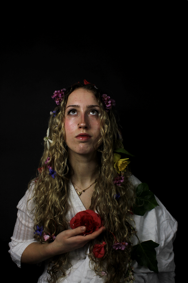
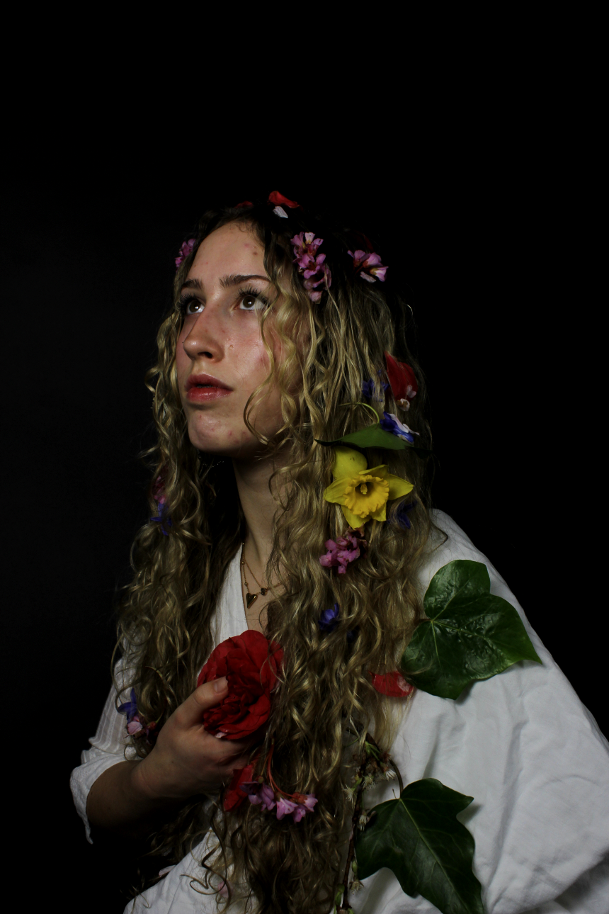
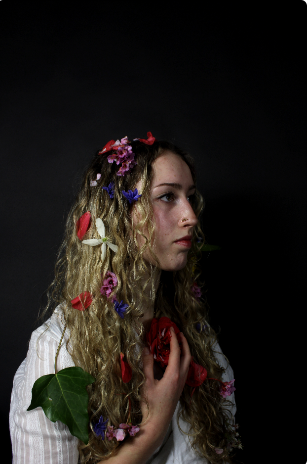
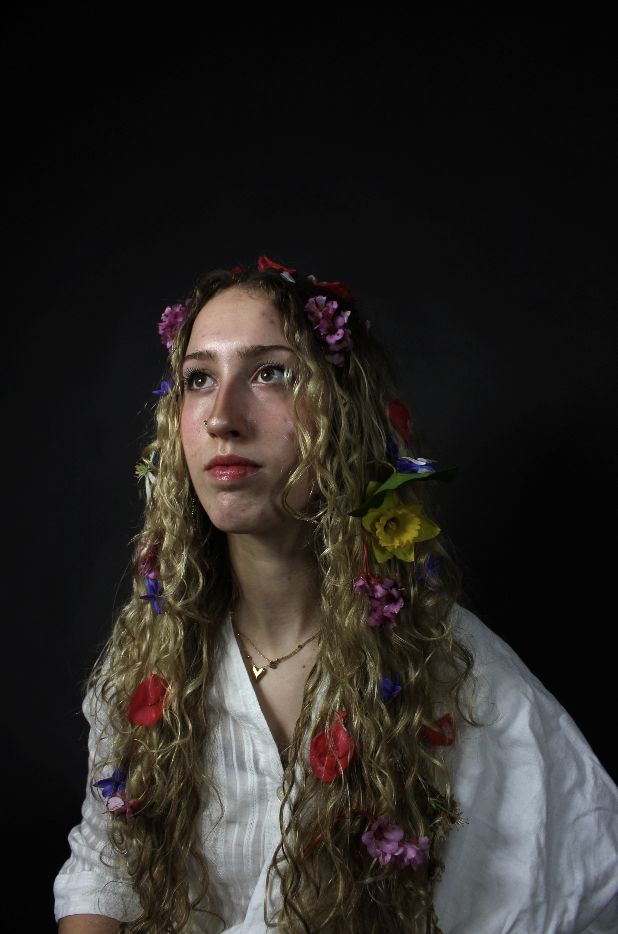
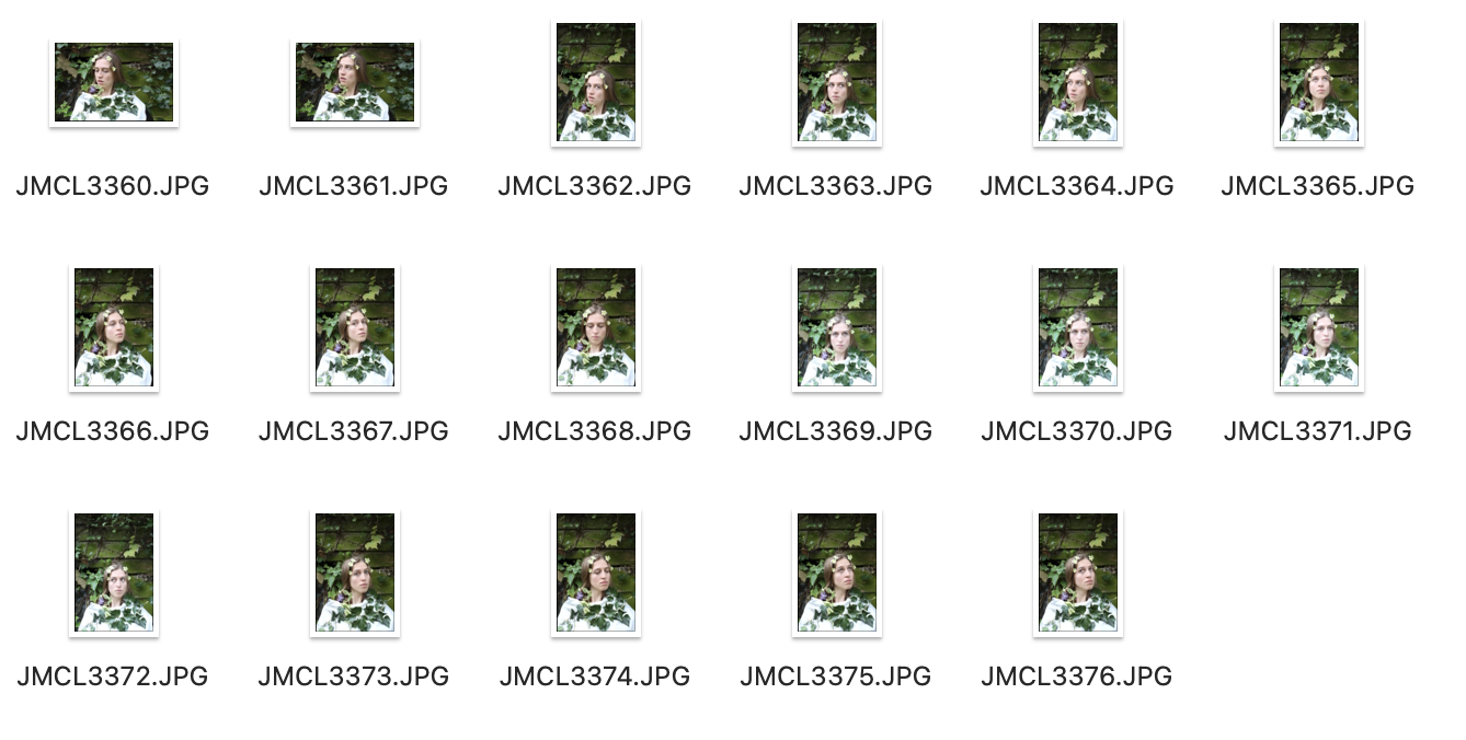
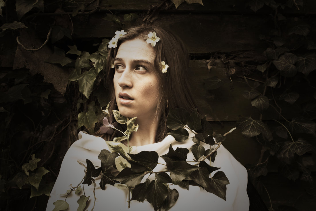
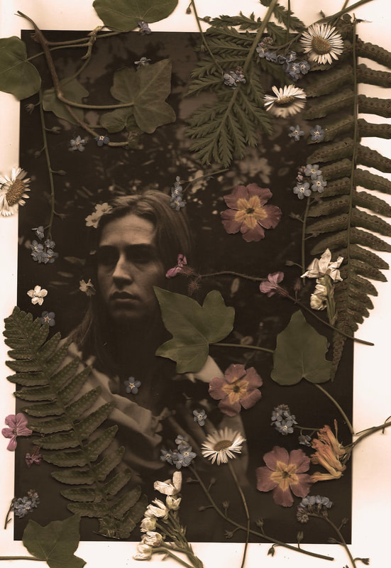
unedited photographs:
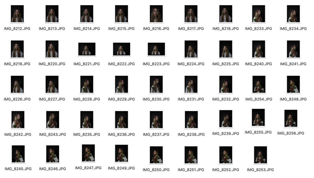
When taking these portrait photographs I wove flowers through my subject's hair to create this ethereal, pre-raphaelite finish. Inspired by Cameron's work I wanted my photographs to engage in her 'soft focus technique' which gives the image a dream-like quality, often using dramatic and symbolic lighting. I used artificial studio lighting, and purposefully only used one light, lighting up the side of her face. The flowers are woven into my model's hair linking with the theme of naturalness which is continued through the use of flowers on the photographic paper.
|
|
|
|
inverted negative edits:
|
|
|
|
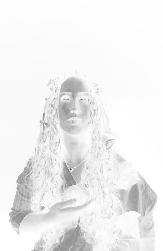
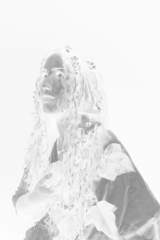
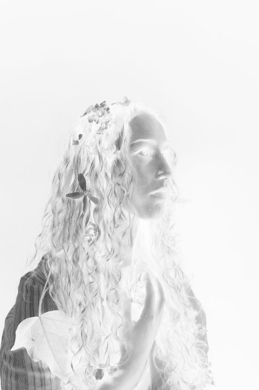
With these lumen prints, I edited them in Photoshop turning them grayscale, and then inverted them. I inverted the photographs, making them positive so that when I printed them onto acetate and placed the acetate sheets onto the photosensitive paper, it would appear a positive photograph. I arranged plants around the acetate sheet surrounding the portrait.
process of exposing the lumen print using the negative acetate:

|

|
I arranged the plants upon the acetate surrounding the portrait of my subject and placed a clean piece of glass holding everything together as it doesn't move the acetate sheet and plants around creating a double exposure look which happened to one of my prints. I left the print for five or so hours to be exposed using the artificial light in the wooden light box.

|

|

|
Double exposure accident:

This occurred due to the movement of the acetate on the light-sensitive lumen film. The shift of the acetate caused it to create a double exposure look where it appears blurry. This is an interesting effect, however I prefer the sharp clarity of the others.
|
When photographing these lumen prints, due to their reflective material I photographed them on a light box in a fairly dark room to avoid capturing reflections. I left the last two prints exposed to artificial light overnight which allowed the silhouettes of the acetate white my photographs printed on them to faintly appear. The silhouettes of the plants stand out surrounding my subject. I found that the best photographic paper was the dark reflective sheets as they allowed the positive of the portrait appear, whereas the pale blue sheets, when I attempted to creat portrait lumen prunts using them, they where unsuccessful. Overall I think the lumen prints turned out well, however to develop this I want the portraits to appear stronger, so when I next edit the photographs I will attempt to accentuate the contrast.
Exhibition: Francesca Woodman and Julia Margaret Cameron
Portraits to Dream In
Portraits to Dream In

|

|
The exhibition includes prints made by Francesca Woodman and Julia Margaret Cameron in their lifetimes. The pairing of Cameron and Woodman appeared to be an eclectic choice, given their distinct backgrounds and the century that divides them. Woodman and Cameron are two of the most influential women in the history of photography. They lived a century apart – Cameron working in the UK and Sri Lanka from the 1860s, and Woodman in America and Italy from the 1970s. Both women explored portraiture beyond its ability to record appearance – using their own creativity and imagination to suggest notions of beauty, symbolism, transformation and storytelling. This exhibition showcased more than 160 rare vintage prints, it suggests new ways to look at their work, and the way photographic portraiture was created in the 19th and 20th centuries. Cameron is celebrated for her theatrical, literature-inspired scenes, while Woodman is admired for her raw, unfiltered exploration of self and femininity during the nascent years of the women’s movement. Both are quintessential romantics they have similar ways of approaching and staging photographs such as the use of props and costume. Other aspects of their work I found the fragile-like qualities inspiring such as Woodman's crumbling and cracked plaster of the wall behind one of her photographs and the breaking down of the emulsion on the surface of Cameron's prints. This came as a result of a damaged negative. Both reference the positive and negative using contrasts in both of their prints.
Francesca Woodman handprinted her work, making mainly gelatin silver prints in the darkroom. Cameron made albumen prints using the wet collodion process. She made prints from glass plate negatives.
Francesca Woodman handprinted her work, making mainly gelatin silver prints in the darkroom. Cameron made albumen prints using the wet collodion process. She made prints from glass plate negatives.

Julia Margaret Cameron - The Rosebud Garden of Girls
Albumen print, June 1868 |
Cameron's 'Rosebud Garden of Girls' photograph stood out to me the most. The femininity of the women is exaggerated by the use of flowers and natural beauty. The long white blouses imply the purity of the women. This placement within nature describes a deep connectedness between the women.
Cameron embellishes her sitters with garlands wrapped around their necklines and the flowers spouting from the seams of their dresses which exaggerates the women's physical beauty. The free hair and ethereal faces of these four sisters are a reflection of the ideal of beauty established by Pre-Raphaelite painters, with whom Cameron was closely connected. |
The majority of the works of both Francesca Woodman and Julia Margaret Cameron were indoors. Female subjects located in nature were a significant aspect the spatial relationship of the female body in relation to nature and position delicate floral arrangements on and near their women sitters.
Delicate floral arrangements are also integral to the majority of Cameron's portraits of women, physically entwining her sitters - garlands wrapped around necklines, flowers sprouting from the seams of dresses and blouses, blooms held close to the chest. tied to ribbons, or tucked into drapes and folds of fabrics. Cameron often articulated her ambition as a photographer as capturing transcendent beauty. Embellishing her female sitters with flowers could be revealed as a homage, or as an emblematic equivalence of their physical beauty.
Delicate floral arrangements are also integral to the majority of Cameron's portraits of women, physically entwining her sitters - garlands wrapped around necklines, flowers sprouting from the seams of dresses and blouses, blooms held close to the chest. tied to ribbons, or tucked into drapes and folds of fabrics. Cameron often articulated her ambition as a photographer as capturing transcendent beauty. Embellishing her female sitters with flowers could be revealed as a homage, or as an emblematic equivalence of their physical beauty.
Development
Un-edited photographs:
|
|
|
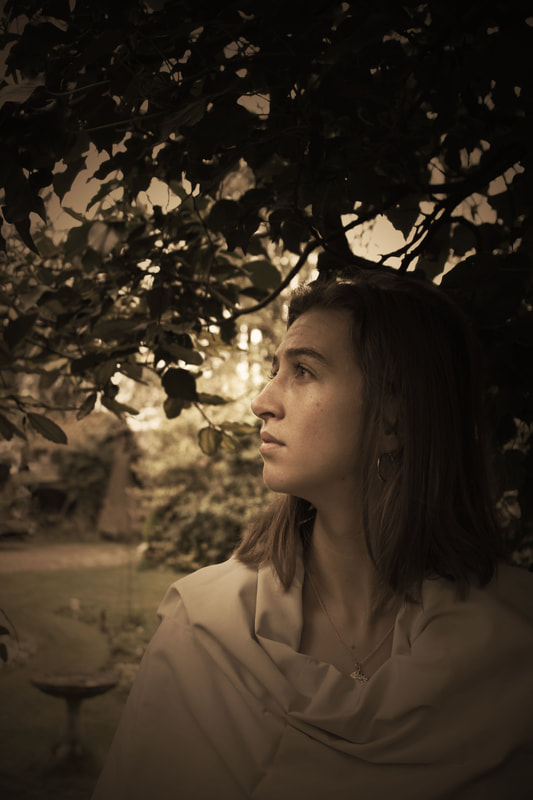
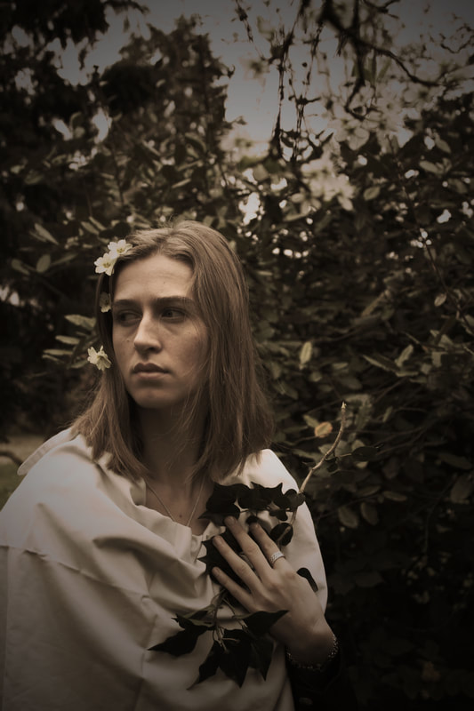
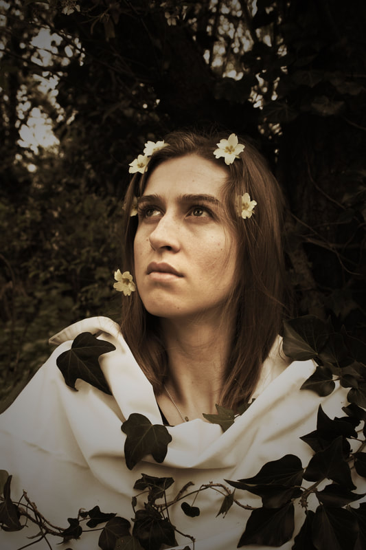
For these photographs, I went to the Suffolk countryside where my grandmother lives and used my sister as a model. I chose to take photographs in her large garden as it was appropriate in response to the style of Julia Margaret Cameron's photography. I purposefully placed plants around my subject and took the photographs with my model immersed in a greenery background. These photographs are influenced by the romantic style of Cameron and Woodman's Pre-Raphaelite photographs as shown in portraits to dream in.
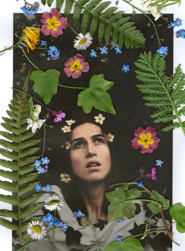
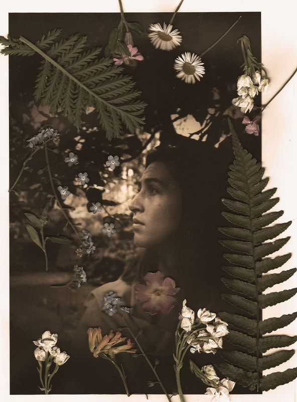
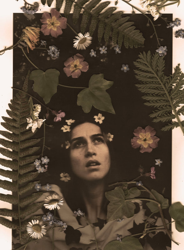
photoshop sepia editing technique:
Edited photographs:
|
|
|

|
|
With these photographs, I edited the colouration of them to bring out the sepia tones influenced by the Pre-Raphelite style of the photograph. My model worked well as I embellished her with plants and flowers and draped a white cloth around her. Flowers often carry symbolic meanings and like Cameron, I used flowers to symbolise various qualities such as beauty and innocence. The plants and flowers picked from my grandma's garden add depth, texture, and colour to the composition. The environment was similar to Woodman’s work as she predominantly took photographs of her subjects in lush, rural environments. I edited my photographs bringing out the sepia tones and then placed the printed versions in a scanner with a selection of plants. I edited a few keeping the vibrant colours which juxtapose the sepia tones.
Flowers are often associated with femininity, purity, and sensuality. By incorporating flowers into her portraits of women, Cameron may have been exploring and challenging traditional notions of femininity and beauty.
Flowers are often associated with femininity, purity, and sensuality. By incorporating flowers into her portraits of women, Cameron may have been exploring and challenging traditional notions of femininity and beauty.
Development

|

|

|
|
|

|
|
I think that these scans were successful as the bright and vibrant colours contrast with the discoloured sepia tones of the photograph. The embellishment of flowers and plants around her (especially the flowers in her hair) give the photograph a depth of field and makes the plants placed onto the photograph more three-dimensional and stand out. To improve my final outcome I could've experimented with staining the paper with coffe or tea to give it those sepia tones that I desired.
Development

I took these photographs in the studio using artificial lighting. These photographs were taken with the intention of editing them in Photo
shop turning them black and white, then inverting them to print them out on acetate so that when I use them on the acetate it creates a positive print.
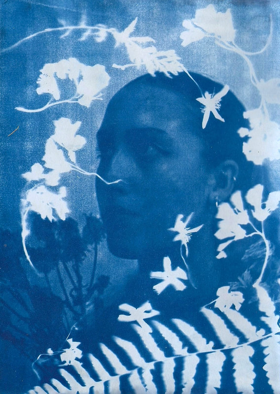
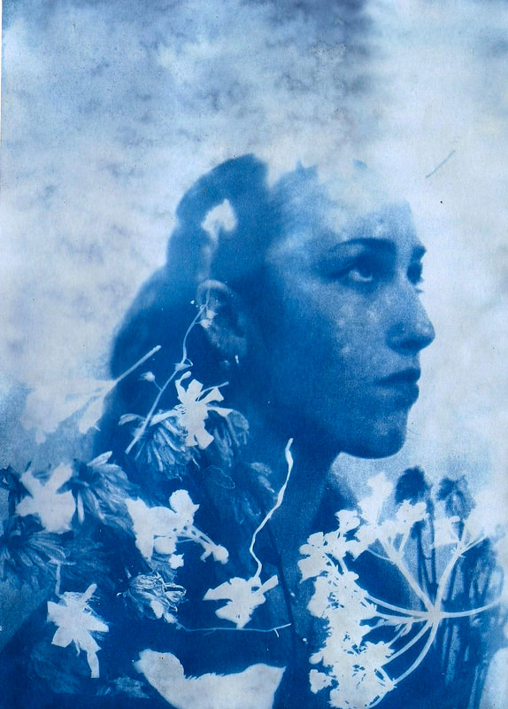
I experimented by using a light box (artificial light) and leaving them exposed for two hours along with exposing them in the natural sunlight for 5 minutes. I found that the prints left in direct sunlight were most effective as they created a deep blue which contrasts with the pure, pale white tones. I positioned plants and flowers around the portraits, specifically ones which I thought would create intricate patterns which juxtapose the blue.
shop turning them black and white, then inverting them to print them out on acetate so that when I use them on the acetate it creates a positive print.
I experimented by using a light box (artificial light) and leaving them exposed for two hours along with exposing them in the natural sunlight for 5 minutes. I found that the prints left in direct sunlight were most effective as they created a deep blue which contrasts with the pure, pale white tones. I positioned plants and flowers around the portraits, specifically ones which I thought would create intricate patterns which juxtapose the blue.
|
Cyanotype paper before being soaked in water

|
The paper transforming after being exposed to water

|
Once exposed to water it took around a minute for it to transform. The exposed areas turned a deep Prussian blue and the areas which were blocked from the light turned a pale white. Once left to dry the blue tones tend to deepen.

|

|

|
|
|
|
With these prints, I used the negative photograph that I edited in Photoshop and turned black and white, then inverted it to print on acetate and create a positive image to transfer it onto the cyanotype light-sensitive paper. These were effective, especially the dark blue tones that came through. Next time to improve my prints I would try experimenting with fabric in stead of paper.

|
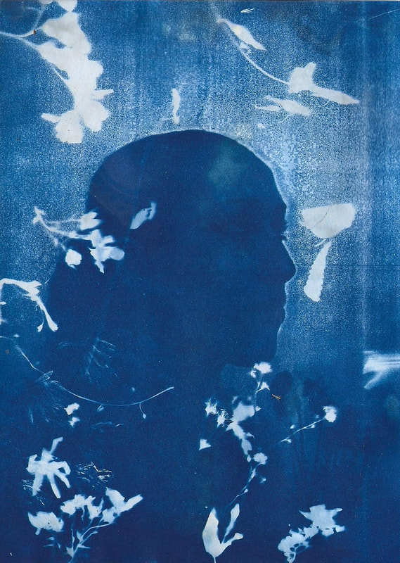
These two were ones that went slightly wrong. The one on the far left shows a double exposure. This occurred because the sheet of acetate moved in the wind while it was being exposed. The print on the right hand side also created a double exposure effect but turned out inverted as the acetate wasn't printed out as inverted.
|
Final Developments
Floris Neusüss Photograms are Haunting and Beautiful
|

|
Floris Neusüss was born in Lennep, Germany in 1937 He is best known for his “Körperfotogramms”, or whole-body photograms.
A photogram is a photographic image made without a camera by placing objects directly onto the surface of a photo-sensitive material such as photographic paper and then exposing it to light. The result is a negative shadow image varying in tone, depending on the transparency of the objects used. Areas of the paper that have received no light appear white; those exposed through transparent or semi-transparent objects appear grey.
However in my interpretation of Neusüss work, I used created cyanotype liquid, soaked it on fabric, let it dry and then exposed it to natural light which brings out these Prussian blue tones in the exposed areas
Process
The light-sensitive chemistry in a cyanotype consists of equal parts ferric ammonium citrate solution and potassium ferricyanide. I immersed the large, life-size white fabric in this solution, squeezed and left it to dry. The fabric is then exposed and ‘developed’ in water, rinsed, squeezed and dried. The blue comes from the formation of ferric ferrocyanide, also known as Prussian Blue. The areas that are exposed turn this deep blue.
To get the best exposure I placed my print outside in the natural, bright light.
To get the best exposure I placed my print outside in the natural, bright light.
First attempt

With this first experimental fabric print, I cut up a piece of fabric and positioned foliage and flowers across held down by glass so that the wind wouldn't blow away the flowers which would disturb the silhouette. I then positioned myself on top of the fabric. I lay down for 20 minutes exposed in the daylight. I think that the daylight is most effective for exposing the print as opposed to artificial light which would be more time-consuming.
The development of my projects:

un-edited set of studio lighting photographs:

Editing process:
|
unedited photograph

|
edited, grayscale

|
inverted with white background

|
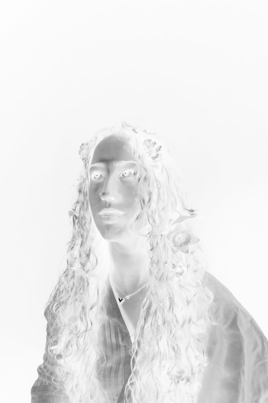
The intention for this new set of portraits where similar to earlier cyanotype processes, yet instead of creating them on light-sensitive paper I'm creating a cyanotype print on fabric with the purpose of sewing them onto my life-size cyanotype print. Along with the fabric cyanotype prints of portraits, I'll also be sewing flower cyanotype prints onto the larger fabric print.
Process of exposing the print to natural light:
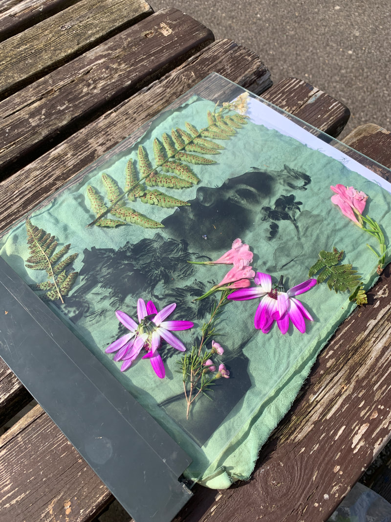
I left the cyanotype fabric out on a flat surface, placed the acetate and flowers down and kept them from blowing away by using a clear weighted glass over the top.
|
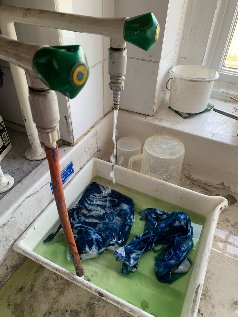
After the fabric had been exposed for around 15 minutes I placed them directly in water, which developed them, bringing out the Prussian blue and pale white.
|
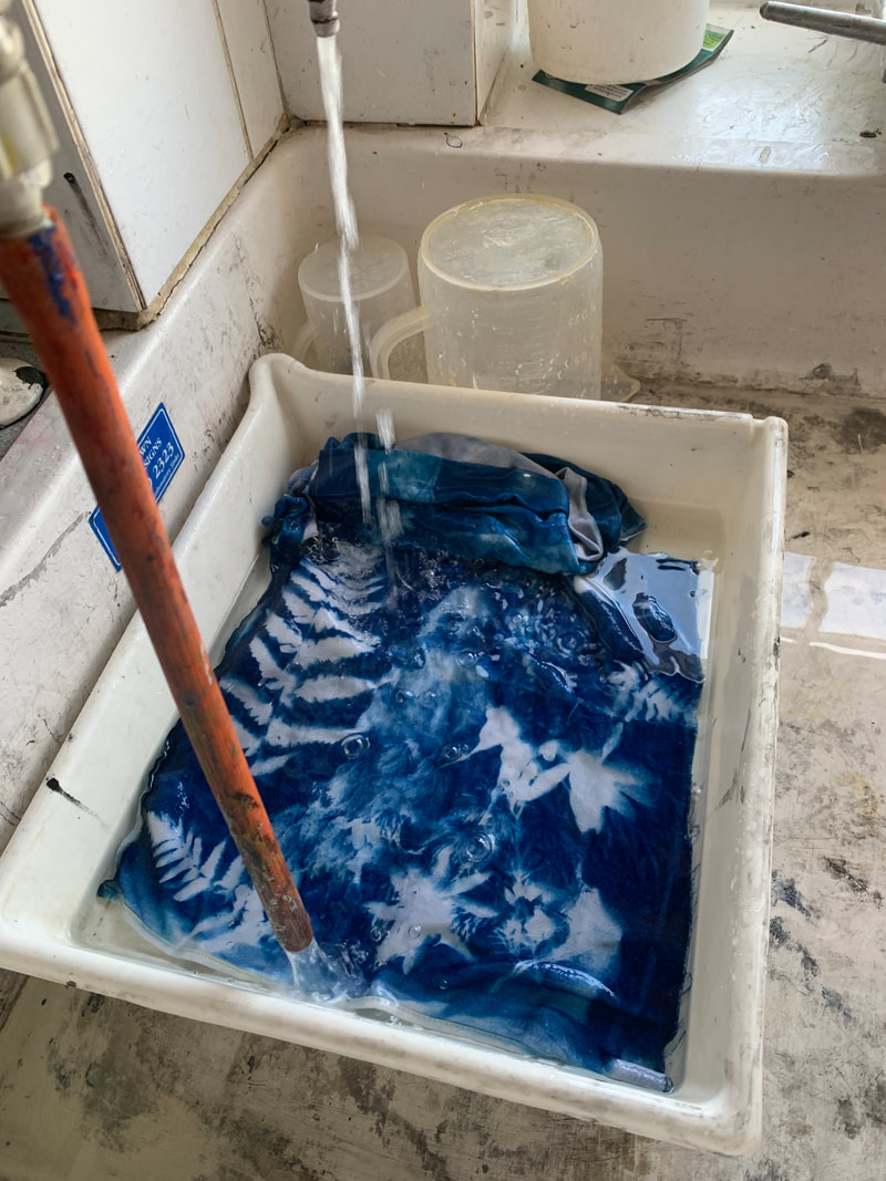
Soak them in the water until it runs clear (no green), then dry them.
|
Fabric portraits:

|

|
These portraits came out well as you can clearly distinguish a face. The foliage surrounds the portrait well as it fills the potential negative space.
This process of cyanotype of fabric is much more challenging than light-sensitive paper as you have to make sure the balance of chemicals is even otherwise it impacts your final outcome. Having an imbalance of chemicals part A and part B can cause your fabric to not change once exposed, also once washed in water it may rinse all the chemicals out and leave you with a plain piece of fabric. Next time to improve I would make sure that the fabric is ironed and left straight when being exposed as when it creases it doesn't allow the light to creep in and leaves it with white lines (as shown in the middle portrait).
This process of cyanotype of fabric is much more challenging than light-sensitive paper as you have to make sure the balance of chemicals is even otherwise it impacts your final outcome. Having an imbalance of chemicals part A and part B can cause your fabric to not change once exposed, also once washed in water it may rinse all the chemicals out and leave you with a plain piece of fabric. Next time to improve I would make sure that the fabric is ironed and left straight when being exposed as when it creases it doesn't allow the light to creep in and leaves it with white lines (as shown in the middle portrait).
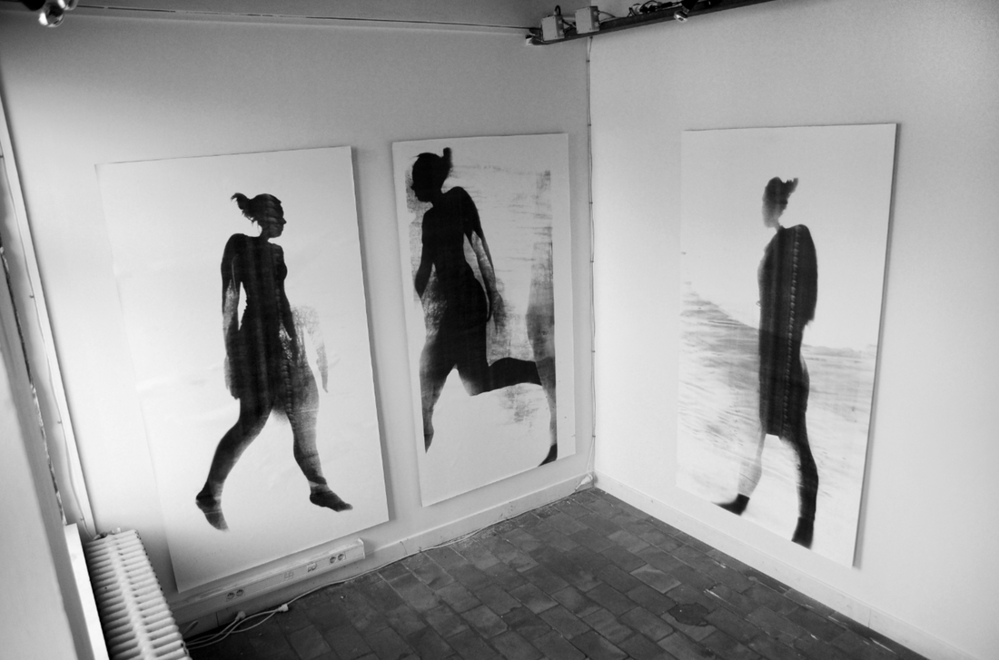
Final piece
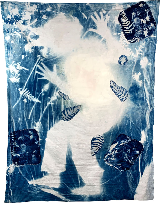
I further developed this technique by attempting to make a life-size cyanotype prints on fabric. My main focus was inspired by the artist Floris Neusüss. I wanted to make a life-size cyanotype print. For this I experimented by practising making smaller prints before I made the large one. I used cyanotype liquid and soaked the fabric in the liquid, making sure it’s fully submerged. I then left it to dry in a dark room. I gathered some plants and when the fabric was dry I positioned the plants flat and pressed them upon the fabric using a piece of weighted glass. I exposed it for 15 minutes, one strip of fabric of just plants and one of my torso pressed against the fabric. Both prints came out well so then I began by using a large cotton bed sheet. Once the large piece of fabric was dry I laid it flat in my garden and scattered flowers around it, while placing myself down and setting a 15 minute timer. The exposure of the print relied on the brightness outside, so the brighter it was the less time it needed to be exposed for. The cyanotype fabric process was quite time consuming, however it came out well once washed in water and developed. I attempted to make some cyanotype portraits along with my large print with the vision of hand stitching them onto it along with a few singular plants. My portraits resembled the style of my earlier ones, as I placed flowers in my subject's hair. One of the difficulties of this process was that it was hard to keep the fabric straight when lying on it, however it has created ripples which appear like a body of water. To avoid the white creases I could lie down on a smoother surface e.g a large piece of card. However, the creases it making at appear more like a fabric and give it some definition and movement.
Overall, the life-size print turned out well my silhouette is apparent and the whiteness where the areas have blocked the light juxtaposes the Prussian blue tones. The portraits with fabric came out well, you can make out the highlights of the portrait quite clearly which gives it some depth and definition. Next time to improve my final outcome I would attempt to find a larger piece of glass for the print to keep the plants and flowers down.
