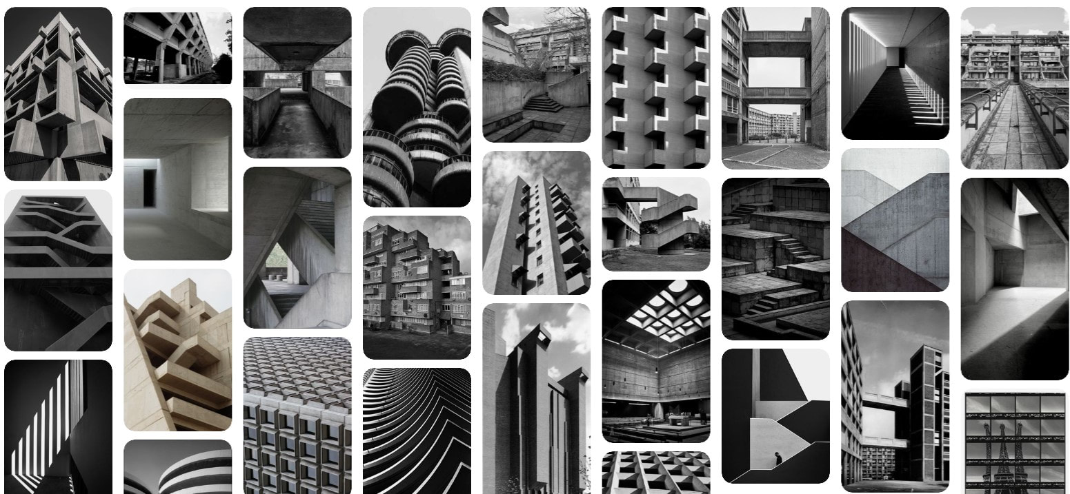
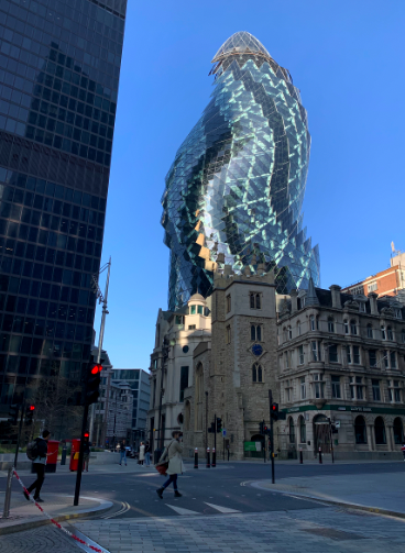
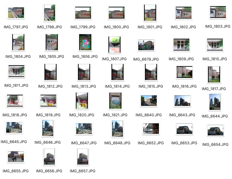
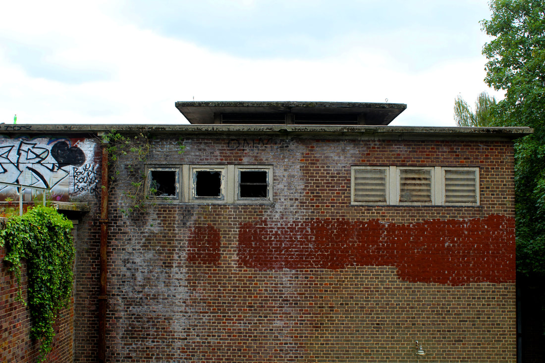
BRUTALIST STRUCTURE
The term Brutalism was derived from the French ‘béton brut’, or raw concrete and the expression became associated with a movement emerging in postwar British architectural offices. Brutalist architecture is strongly connected to the style of the building the material and texture. Brutalist building appear solid and heavy. Many photographers choose to not shoot the brutalist structures such as The Barbican Estate, Brunswick Centre, Southbank Centre, Centre Point, and The National Theatre. The majority of them choose to not photograph in colour as it allows the architectural elements of Brutalist architecture to appear dominating and dramatic and the formulaic patterns stand out.
"The city’s changing architecture is a kind of memorial of humanity’s endeavours and schemes, for all buildings have been fashioned according to the ideologies of their days"
"The city’s changing architecture is a kind of memorial of humanity’s endeavours and schemes, for all buildings have been fashioned according to the ideologies of their days"
Simon Phipps
Photographer, Simon Phipps provided a unique perspective and portrays Brutalist architecture in a sensitive, realistic and distinctive manner documenting and exploring London and its post-war modernist architecture. He enjoys searching for these distinct, unique brutalist buildings and has done so over the past 15 years within the UK. The imagery is screen-printed directly onto brushed aluminium panels that when hung float from the wall, the whole concept reflecting a careful deliberation.

|


|

|
My response
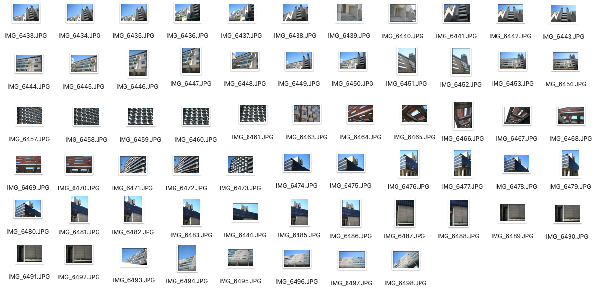
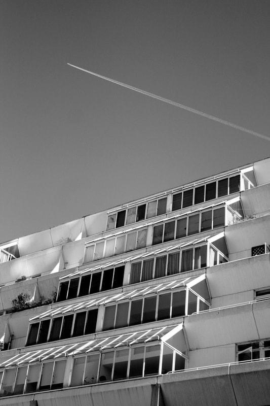
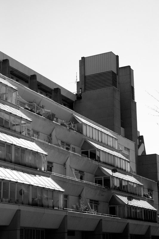
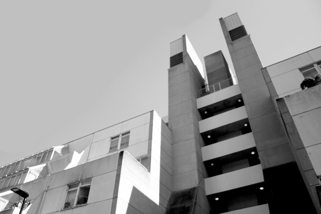
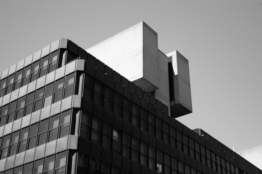
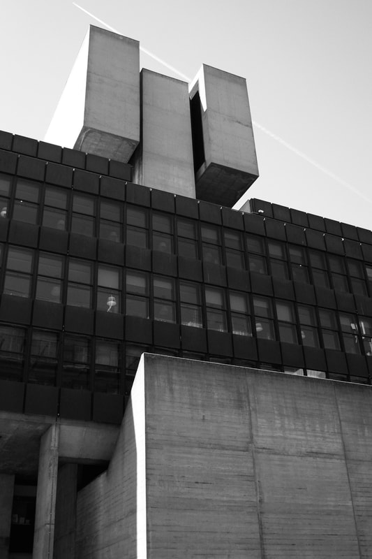
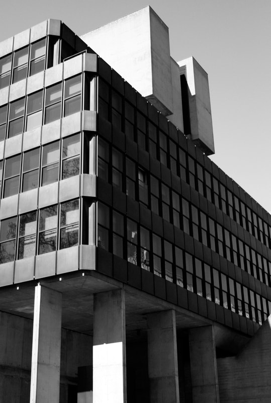
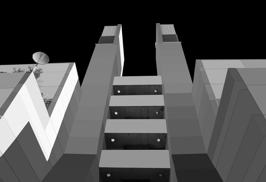
I went to take a set of photographs of brutalist architecture in London inspired by the works of Simon Phipps. For my response to Phipps I picked the The Brunswick centre, Imperial Hotel, IOE and UCL's Faculty of Education and Society. I decided to edit my photographs by turning them black and white as it made them appear older and gave them character. I adjusted the contrast which made the building stand out from the negative space, being the sky in the background. When photographing I experimented with symmetry and composition but predominately focused on gaining high resolution photographs.
The Brunswick centre

|
|
Imperial Hotel

|

|
UCL building
|

|
I'm satisfied with this series of brutalist photographs. I feel as if they hit the brief and I think my choice of angles are interesting as they show different detailed elements of the structure of the brutalist buildings. Next time
THOMAS DANTHONY - BRUTALISM
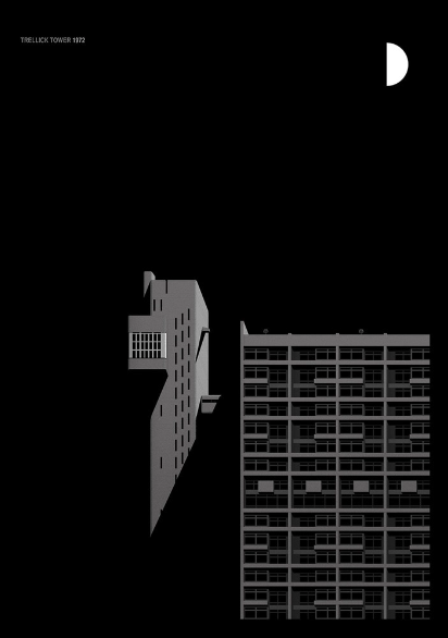
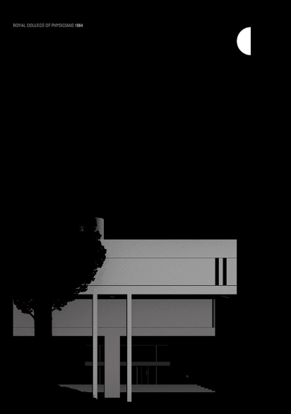
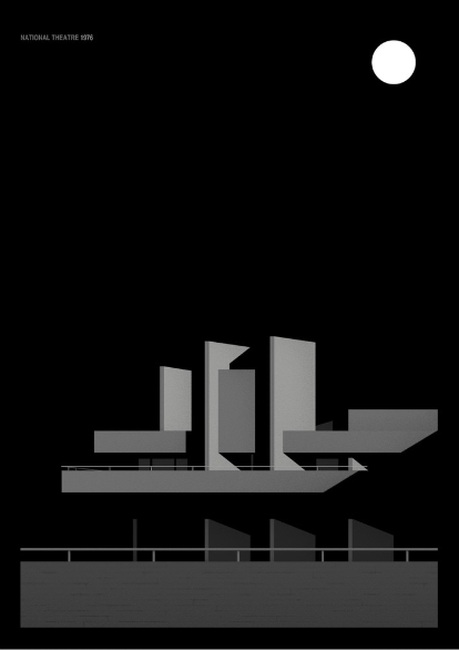
The Brutalism project is a collaboration with Black Dragon press about Brutalist architecture in London.Thomas Danthony is a French artist established in London since 2012.He uses photoshop to simplify his images creating screen prints of his own creations.These screen prints consist of dark shades of black with contrasting shades of grey and white which grab your attention. Brutalist buildings that attracted him were National Theatre, Trellick Tower and the Royal College of Physicians which he simplified within photoshop. Danthony creates screen prints of his works and focuses predominately on negative space usually with a dark, black background, the colour palette of the buildings only consists of different shades of grey which reflect on the theme of brutalism almost appearing as a concrete. His edits show buildings with concise sharp angles and by using different block shades his edits appear 3 dimensional and have form.
|
|
|
my interpretation:

|

|
Evaluation
Overall, I am pleased with the outcome of this response, I think that my editing process worked well in photoshop and show how my work was inspired by Thomas Danthony. The simplification of these buildings are shown through the block colours of grey in the style of Danthony, I even edited one with a dark background which juxtaposes the light shades of greys. However, next time I would focus on more intricate details such as tree and plants to really accentuate the smooth appeal of the edits.
THOMAS KELLNER - BREAK THE STRUCTURE
German fine art photographer and artist Thomas Kellner uses the traditional process of film photography and creates montages, creating unique compositions of world famous buildings he travels to, such as the great wall, and projects on industrial architecture. He was predominately influenced through the history of art. His work explores deconstruction and reconstruction and cubism within his contact sheets which is known as 'visual analytical synthesis' as he creates a myriad of viewpoints within a flattened image. He doesn't necessarily deconstruct architecture yet he reconstructs our concept of it. He started off by experimenting with pinhole cameras and multi-perspective approaches distorting the photos.
"My photographs serve different layers of meanings. One is to break architecture into pieces - to break something that we know as very stable. Second, is to confront our own idealistic image with my works that shows us that we cannot capture the world like we visualise it."

|


|

|
My response:
For this response, I've made a series of reconstructed and deconstructed buildings framed within a contact sheet, inspired by the works of photographer Thomas Kellner. To create these pieces I used the platforms photoshop and bridge. My process is shown in the detailed slide show below where I show the photoshop process in steps. I used images from three different shoots, one being brutalist building trellick tower, another being deep in central London and the last I picked a photograph I took in Paris of the famous Eiffel tower. My aim was to help viewers look at the structure of a building in a different way through the deconstructed edits of them. It confuses the viewer through an unusual way of visualising a building.
unedited photos: Template:

|

|
photoshop attempts:

|

|
bridge attempt:

Evaluation
I'm satisfied with my efforts in 'breaking the structure', deconstructing buildings. I'm especially pleased with the discoloured Eiffel tower edit as I feel like it perfectly encompass a deconstructed building and it would make viewers question the realism of the photograph. However, next time I want to explore more on the app bridge and attempt more edits.
I'm satisfied with my efforts in 'breaking the structure', deconstructing buildings. I'm especially pleased with the discoloured Eiffel tower edit as I feel like it perfectly encompass a deconstructed building and it would make viewers question the realism of the photograph. However, next time I want to explore more on the app bridge and attempt more edits.
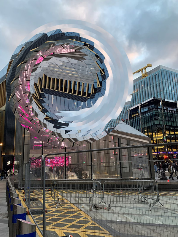
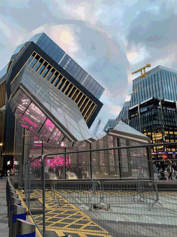
TWISTED STRUCTURE
NICHOLAS KENNEDY SITTON
San Francisco-based photographer Nicholas Kennedy Sitton was intrigued by the distortion of architecture along with his inspiration in San Francisco.He takes photos of buildings and manipulates certain focus points to appear as they are collapsing in on themselves within a spiral, while leaving other areas completely untouched.This distorts the viewers perception making them question what they are visualising.He manages to make his images appear in this hypnotic manner by selecting a particular area of his photo decreasing the size of the cut out and rotating it very slightly each time.

|

|

|
DAVID COPITHORNE
David Copithorne is a Brazilian photographer that mixes around with digital manipulation, film and geometry in photoshop.He manipulates predominately landscape photos or architectural structures and twists them giving it this futuristic look.The lighting within this photos is slightly filtered and tinted which is provoked through the use of film and film manipulation.Similar to Nicholas Kennedy Sitton he distorts the pictures making them appear as if they are collapsing .

|


|

|
my interpretation:
|
twist edit technique:
|
moving giff edit technique:
|
|
By using this photoshop technique as shown through the process above, it creates an unsettling and interesting structure of the building. The final edit makes the building appear as if it's collapsing or it's being sucked into the air like a tsunami as bits of the lower down buildings that I managed to capture in the circles when editing also appear as if they are floating into the air.
I think that the building does almost appear as if it is collapsing in on itself, therefore giving it supernatural qualities that are far from reality. I did find this editing process quite challenging as getting the circles symmetrical and on point, in the right position was quite difficult. Next time to improve my technique I would attempt to make my edits look more dramatic by turning the circles more. |
|
|
The gif went really well even though the editing process was quite time consuming and challenging. I unfortunately lost the nice quality of the sky so next time I would prevent it from going pixilated. It may have been a better edit if I used a less chaotic photograph and maybe a building in isolation with a simple structure so the edit of the giff is more effective.
STRUCTURE OF THE BODY
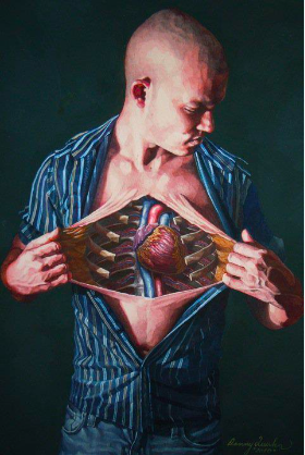
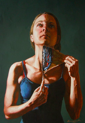
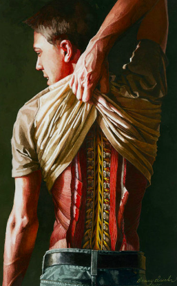
DANNY QIURK
Danny Quirk is an artist who focuses predominately in photo realistic water colours and painting what the camera seems to fail to capture.He experiments with different poses dramatising the lighting illustrating whats underneath the skin as he focuses on a certain area/feature of the body anatomy and exposes it. He uses a variety of mediums such as liquid latex, acrylic paint and sharpies. Quirk also paints realistic drawings directly onto the skin of the human body to reveal the human anatomy underneath. His perception and concept was to bring medical text books to life.
Quirk's images are thought-provoking as they reveal the interior of an anatomy and it makes viewers uncomfortable and on edge when veiwing the intricate details embedded in his work.
Quirk's images are thought-provoking as they reveal the interior of an anatomy and it makes viewers uncomfortable and on edge when veiwing the intricate details embedded in his work.
|
|
|
my interpretation:
|
In order to recreate my own interpretation of Danny Quirk's work, I photographed my models against a white background in the photograph studio. I used artificial lighting which was directly pointed at both my subjects faces so make sure I captured a clear and concise portrait.
I photographed different varying angles of my models such as their side profile, so I could later on experiment with different edits like the side profile of a skull. I photographed my models from different distances, so I could alter the proportion of the skull to fit their faces. Overall, my favourite angled shot was the side profile of the face as I felt it was a successful and unique edit. |


|

|
The skull blended in well with the models face especially when changing the opacity of the layered image and putting the grayscale filter on it adding to the realism of the look.Next time to improve my photos I will focus on other elements of body instead of the face and attempt to blend the skull more seamlessly making it appear more realistic.
STRUCTURE OF NATURE
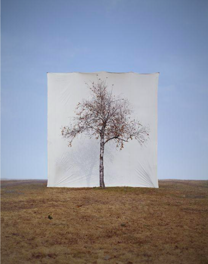
MYOUNG HO LEE
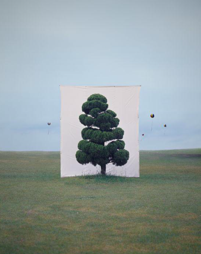
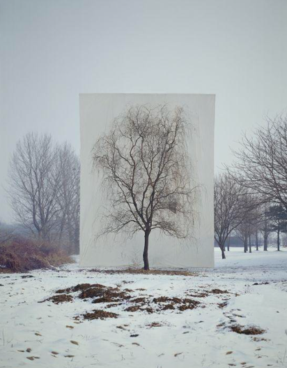
In 2004, Myoung first began photographing trees with the intention to reposition common elements such as trees that we don't often notice to celebrate in its unique structure. In this way it could be said that Lee is not making surreal images but rather using apparatus such as the white background to highlight the beautiful features and structure of the trees of which we overlook in our everyday life. Myoung went through a long process with this project by constructing a temporary studio with the help of a large crew and heavy cranes as seen in the images below. He wanted to capture the organic structure of the isolated tree. The separation element isn't an attempt to create a surreal image but to allude to the surrealist elements of nature itself. Myoung Ho Lee considers bigger issues in society, perhaps how we overlook things we become familiar with seeing such as the trees, yet when spotlighted in such a way we are able to process not just the tree but the beauty in nature. This is clear in his composition by using different backgrounds and a variety of trees at different times throughout the day. I think it's really intriguing to see a tree in isolation as they are usually grouped together. His work reminds me of photographer Rodney Graham who also photographed isolated trees.
|
|
|
|
Korean photographer Myoung Ho Lee specialises with taking photos the environment specifically of isolated trees behind these plain white canvas, separating it form it's original background making them stand out. His pictures appear as optical illusions His works are largely composed by following four procedures:
1. Selection of The Subject 2. Separation of The Subject (meta-subject) 3. Photographing 4. Confirmation of The Separation The white background shows Lee's experimentation as the separation of the tree from it's typical environment which makes viewers question the authenticity of photography. |

|

|

|

|

|

|

|
Black and White edits :

|

|
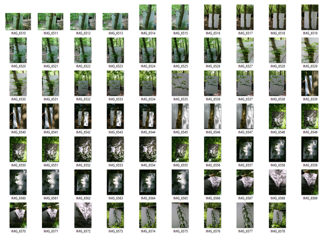
I really like the contrast of the black and white photos of the leafs and the white, plain paper and the shadows that the lighting caused.Next time however I would take photos in brighter environment more similar.Potentially I would also in the style of Myoung Ho Lee make my subject more isolated and somewhat symmetrical leaving an equal amount of white space on each side.Manipulating the light would benefit me, making the white appear brighter as id in a photography studio. When editing on photoshop for a few, I had to edit the persons hands holding the white paper, so next time I will find a way to prop the paper up without the use of a person.
INDEPENDENT DEVELOPMENT
BILL ARMSTRONG


|


|
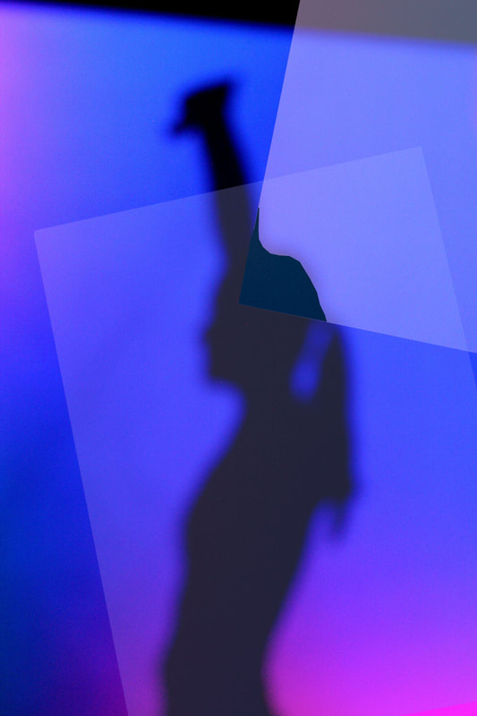
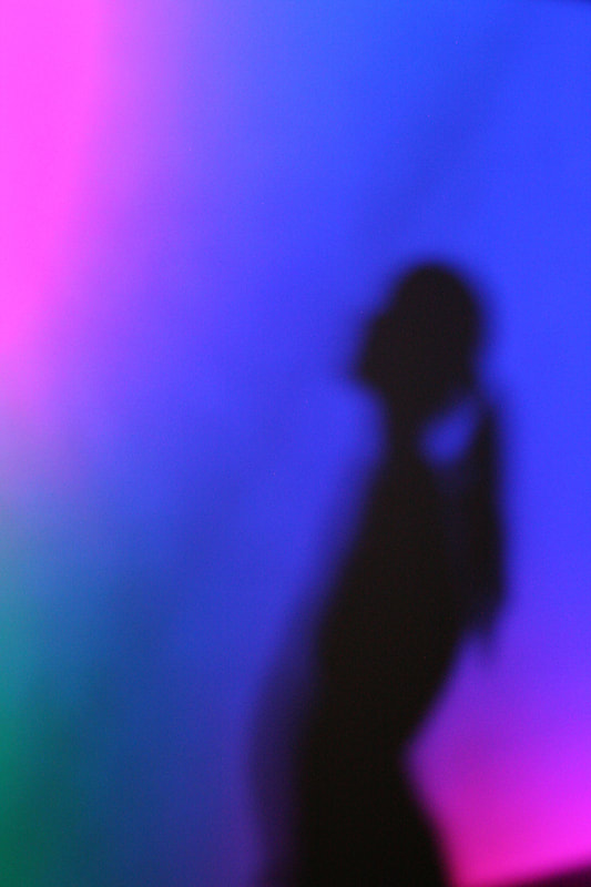
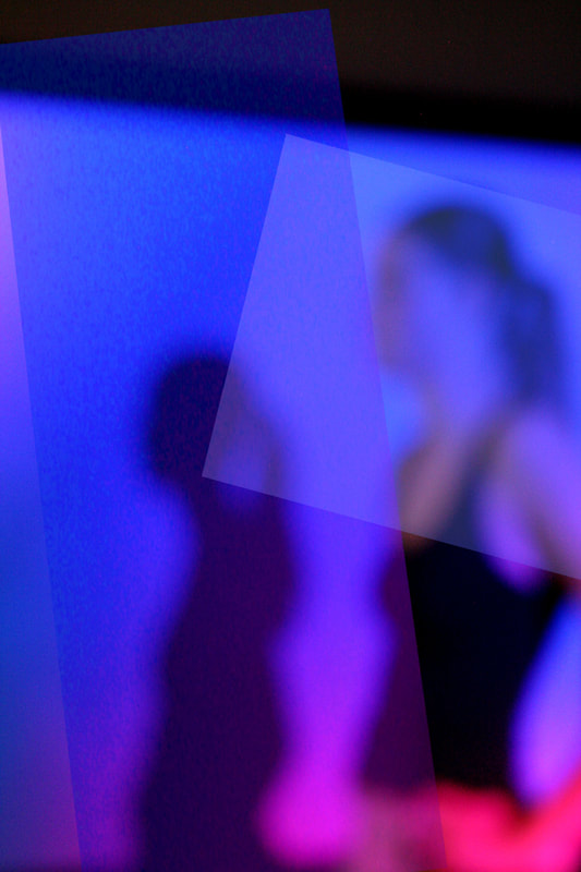
New York based fine art photographer Bill Armstrong is best known for his abstract, intriguing blurred coloured photographs. Armstrong is intensely fascinated by the profound effect that colour can have on emotions and perception. Through his 'Infinity Series' his photos revolve around this lush, semi-abstract, semi-figurative effect. His unique de-focusing affect blurring his subject creating an abnormal photo converting from the ordinary clear photo. He manipulates his photos by painting them, cutting them and re-photographing them making them seamless to the eye.
He stated that 'we can believe something is real, while at the same time knowing it is illusory' .He use of vibrant colours distracts the viewers eyes while simultaneously drawing them into the photo creating this fantasy world almost dream like. Blurring the pictures disguises the figures identity from the viewer making them remain anonymous adding to this visual confusion. He claims that 'one blurry photo is a mistake but 100 blurry photos is an art'.
He stated that 'we can believe something is real, while at the same time knowing it is illusory' .He use of vibrant colours distracts the viewers eyes while simultaneously drawing them into the photo creating this fantasy world almost dream like. Blurring the pictures disguises the figures identity from the viewer making them remain anonymous adding to this visual confusion. He claims that 'one blurry photo is a mistake but 100 blurry photos is an art'.
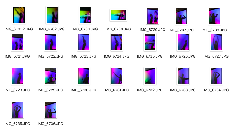
With my response to Armstrongs 'Infinity series' I made my subject stand in front of a projector as I captured her shadow along with her figure.Then once editing my photos I used photoshop to add these translucent shapes over my work similar to Armstrong, cutting and layering over his photos appearing almost textured featuring elements of abstraction.
edited:
|
|
|
I think that these photos worked well in the sense that they have features of abstraction which links well with the vibrancy and different tone of colours which grab your attention.I like how her dark shadow immediately juxtaposes the background along with the blur created by the camera which really alike Armstrongs 'Infinity series'
However, to improve my pictures I would have liked to have take myriad of photographs of my subject with different lighting perhaps make them wear bright clothing which the camera would pick up on more as they would stand out from the pink/purple hues.
However, to improve my pictures I would have liked to have take myriad of photographs of my subject with different lighting perhaps make them wear bright clothing which the camera would pick up on more as they would stand out from the pink/purple hues.
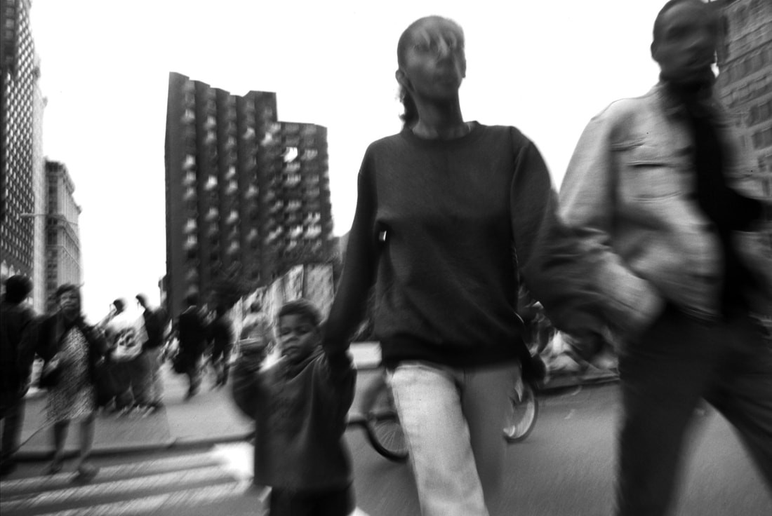
THOMAS LINDAHL ROBINSON


|

|
Passionate American photographer Thomas Lindahl Robinson , starting his photographic journey at the age of 12, he began by photographing his friends and family.He moved to New York and was immersed with this feeling of 'confusion' and being 'out of place', while in New York he was "broke, but not quite destitute", while he upheld a job at a hotel resort, he worked two twelve-hour graveyard shifts on the weekend.
His' fifty-two minutes' series of the blurred unsettling streets with his Leica m6 film camera depicting the movement of people against the urban background.He guessed exposure and the allowed the camera to expose for the light, occasionally not looking through the viewfinder, yet with his photographic eye keen to capture moment.
He alters his shutter speed to acquire the double exposure affect creating a blur within his photos of peoples movement.His inherent feeling of being an 'outsider' within society is reflected in his photographs as they subvert from a focused picture.
My interpretation:
edited:

|


|
What I admired about this strand was that I was able to capture movement with my camera in response to Robinson's 'fifty-two minutes' series in some blurring the subject by shaking my camera or changing my shutter speed.My photos, predominately my second last one really provokes the idea that it could have been taken in the 60s, leaving viewers with this uncertainty about time.However, it was a struggle to capture movement as lowering the shutter speed altered with the ISO meaning that with a few of my photos they where completely white and exposed also due to the brightness outside so often photos taken indoors or in shade worked better.I would also experiment more with the rotation of my lens creating circular movement.
LEFT LONDON
|

|
|
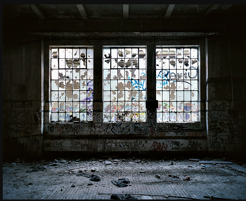
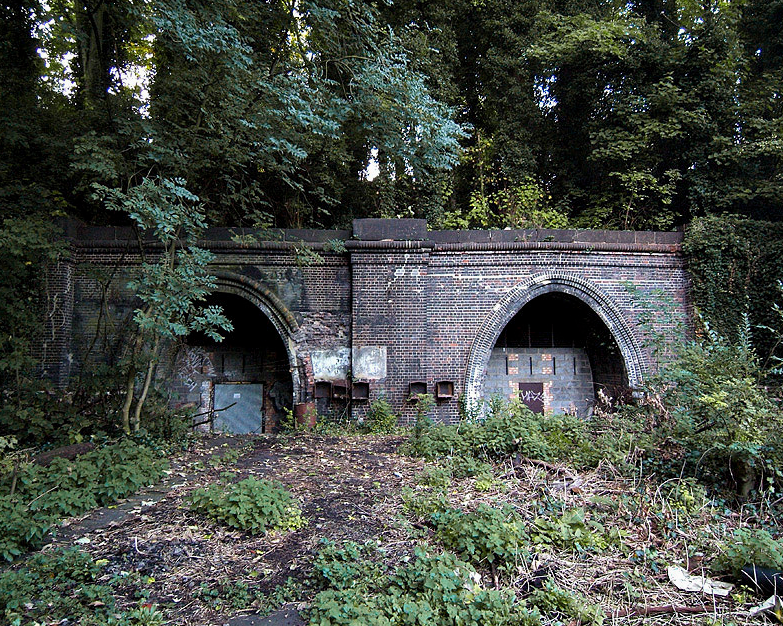
William Eckersley's 'Left London' series was shot over a 12 month period, his photographic portrayal of abandoned buildings were found across his hometown, illustrating this inconspicuous side to urban city life, however with the constant regeneration and urbanisation of urban areas builders are transforming many of these areas which show this decay of London.These forgotten sides of London aren't looked upon or either associated with it's city.I found the photos of abandoned areas thoroughly intriguing as the neglect of these buildings add to the character of the area.

|


|
Second attempt :


|


|
With the next set of photos I went to more central areas of London where I attempted to find contrasting areas, areas that were visibly modern and urbanised next to somewhere that appears as if it doesn't 'fit in'.I found several areas that sort of juxtapose each other through the elements of graffiti contrasting with the glass pane windows of skyscraper buildings.
I found that my first attempt in response to 'Left London' fits better as the place I visited was overtly abandoned, however next time it would be interesting to actually go inside some neglected buildings and take photographs of the abandoned insides.I do like my second attempt as it clearly depicts London's growing changed and development of regeneration buildings and modernism, however perhaps I could have taken closer up photos of the details or potentially buildings that appear more isolated.
I found that my first attempt in response to 'Left London' fits better as the place I visited was overtly abandoned, however next time it would be interesting to actually go inside some neglected buildings and take photographs of the abandoned insides.I do like my second attempt as it clearly depicts London's growing changed and development of regeneration buildings and modernism, however perhaps I could have taken closer up photos of the details or potentially buildings that appear more isolated.
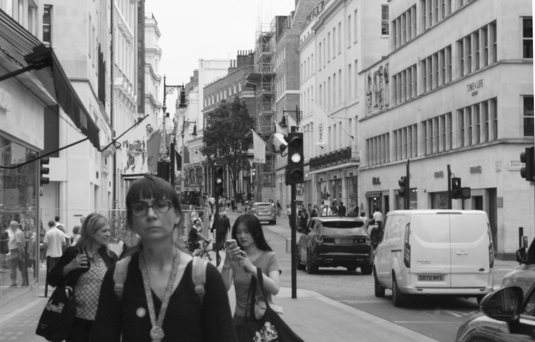
Favourite strand:
My favourite strand was Thomas Lindahl Robinson, I was very fascinated by his 'fifty-two minute' street photography series, and the concept of society being viewed through a lens which I find intriguing.To develop my response I looked at the work of Garry Winogrand and in particular his 'women are beautiful' series where he experiments with photographing women and their appearance walking around the streets of New York.
DEVELOPMENTS
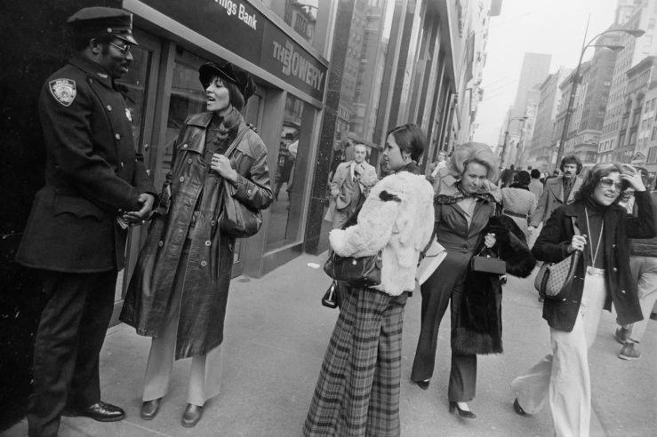
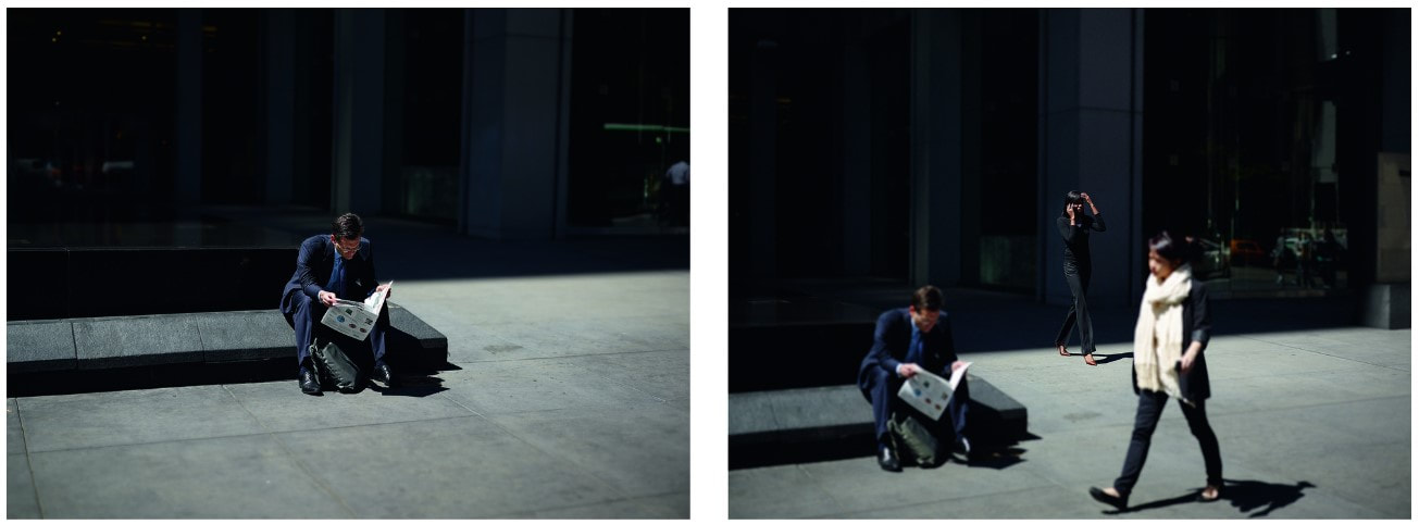
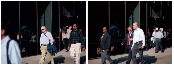
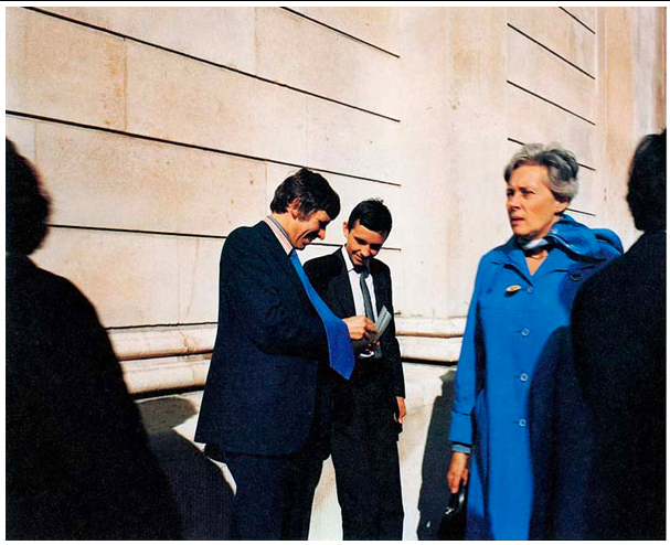
GARRY WINOGRAND 'women are beautiful'


|

|
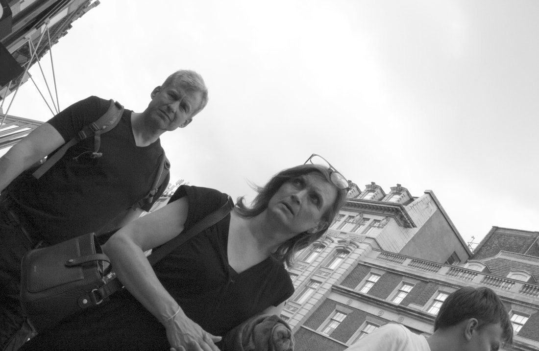
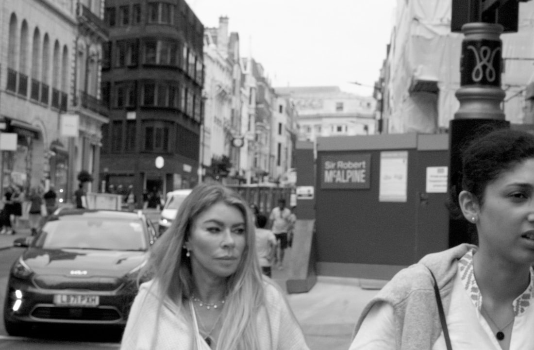
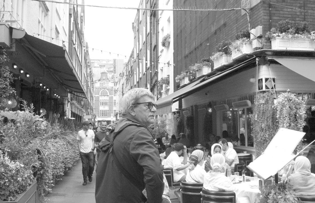
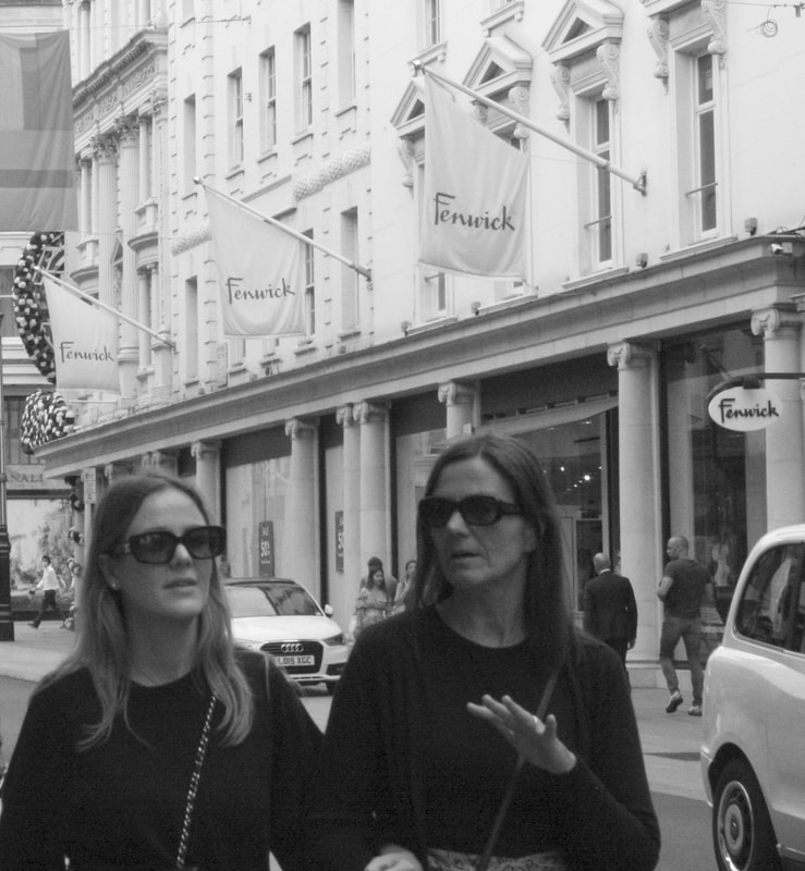
New York photographer Garry Winogrand is best known for his 1960s and 70s street photography. In his 1975 street photography series 'women are beautiful' he captures women in the street through different angles and lenses. The 70s and 60s were at the height of the wave of feminism and the sexual revolution. He took photos of women going about their day-to-day business, capturing their different emotions through his lens along with the steady dramatic social changes brought by women in society. Winograd used a 35mm Leica camera, he loved taking photographs in the busy city environment as it 'gave him the chance to explore the limits of human scale'. He took photos of women capturing their sexuality through their laughter, gestures, fashion, hair and emotions displayed. His photos were predominately taken around the streets of New York and cafeterias, swimming pools and upscale parties.
My interpretation:
|


|
editing process :
edits:
|
|
|

|
|

|
|

|

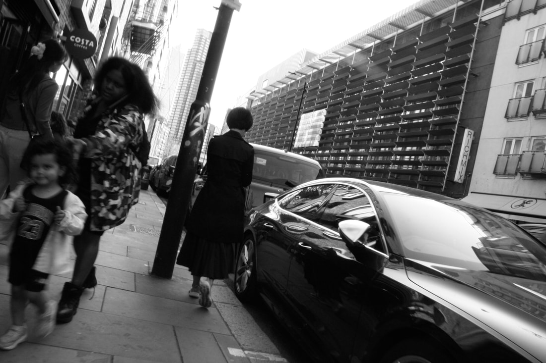
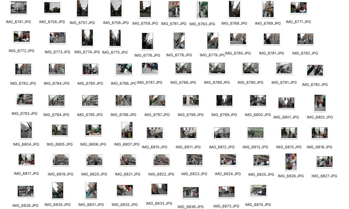
I took these photos around areas of central London such as Mayfair and Soho.I attempted to capture elements of emotion within my photographs alike Gary Winogrand.When editing my photos I removed their colours and turned them black and white to try to imitate the 70s film photography shot with colourless film.It was hard to take photographs as modern day societal dress codes are completely different to those in the 60s/70s.It was challenging to get people to acknowledge the camera as many of my photos show people looking away.
PAUL GRAHAM
|
|
British fine art and documentary photographer Paul Graham experiments with colour film which was unexpected in the early 1980s, which was a time that British photography was dominated by traditional black-and-white social documentary which had a revolutionizing effect on the genre. Soon a new school of photography emerged with artists like Martin Parr, Richard Billingham, Simon Norfolk, and Nick Waplington making the switch to colour.
My interpretation:


|

|
I think my response to Paul Graham worked well as I took different pictures of the same place alike Grahams work and placed them side by side in a frame which makes them stand out.Next time however I would use a tripod to improve the imperfections such as a slight shake and it would also help me to obtain the right angle and keep the same as the others.The vibrant pops of colour really accentuate the photos giving them a modern appeal.
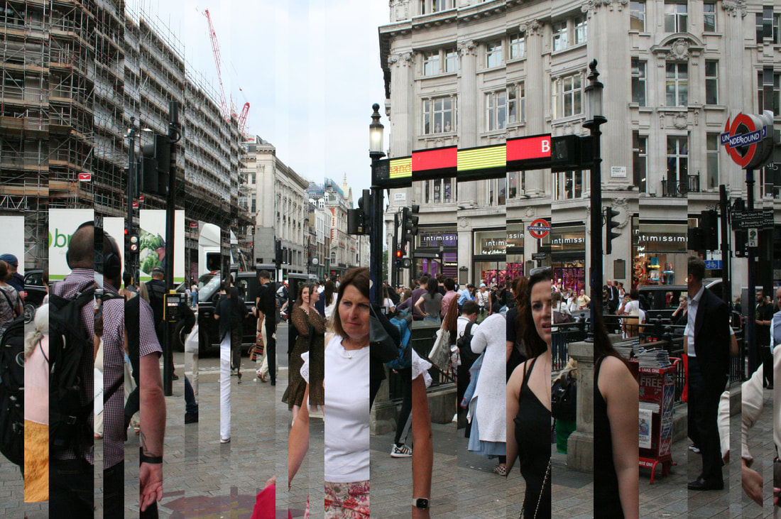
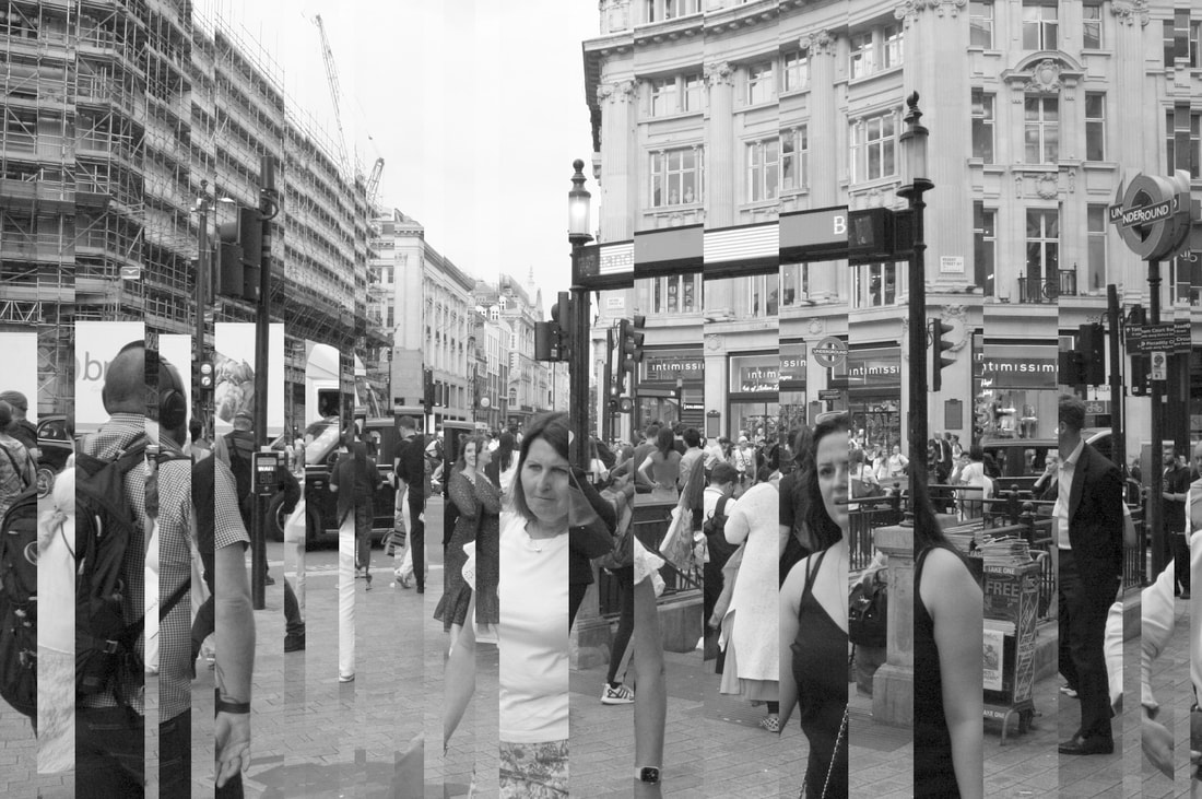
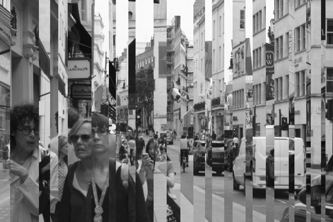
DANIEL CROOKS
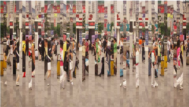
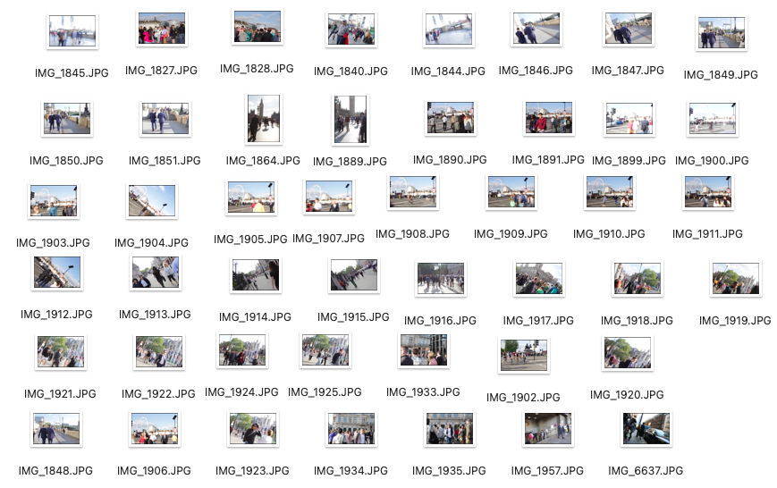
Daniel Crooks is a contemporary artist.He uses digital media and which manipulates his pictures by chopping them up, warping and blending his images creating this distorted finish.He uses a slow shutter speed which gives a futuristic look having lots of different fractions of people.His pictures imitate this idea of cubism.Instead of doing them in colour i'm utilising my pictures in response to Garry Winogrand's street photography series.
|
|
|
|
|
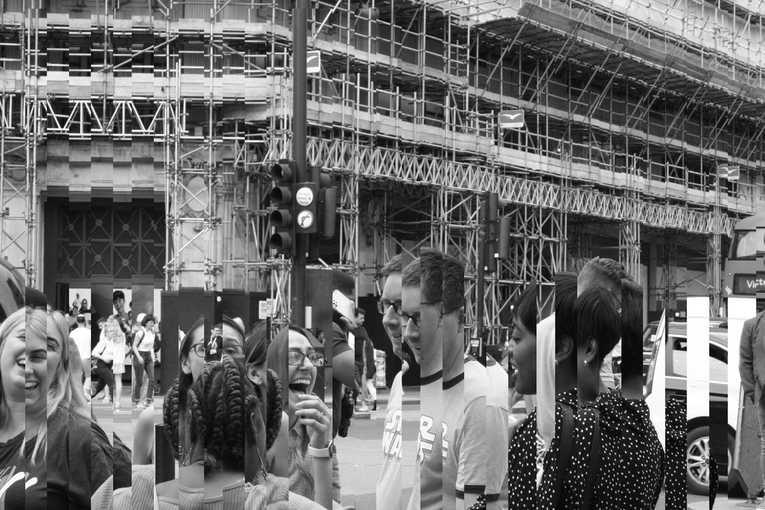
In my images I captured a busy, public crossing. I went to central London outside of Oxford Circus station and took a variety of photos from different angles. I attempted to illustrate my work in relation to Daniel Crooks by editing my pictures on photoshop distorting the photo, like layering straight pieces of a puzzle.
My response to Daniel Crooks was pretty successful as for some when editing I layered two different pictures overlapping each other, using the marque tool along with the ruler to measure precisely the size of the gap to give an even distortion to the picture. However next time to improve my pictures I could possibly change to location creating a contrast from a quieter place to the public place.However, next time I would definitely use a tripod to improve the accuracy of my shots make them in the exact same position when taking the picture.
My response to Daniel Crooks was pretty successful as for some when editing I layered two different pictures overlapping each other, using the marque tool along with the ruler to measure precisely the size of the gap to give an even distortion to the picture. However next time to improve my pictures I could possibly change to location creating a contrast from a quieter place to the public place.However, next time I would definitely use a tripod to improve the accuracy of my shots make them in the exact same position when taking the picture.
Final pieces
|
|
