VIBRANCY
pinterest idea board :

Vibrancy is a crucial element in a lot of film and photographs as bright colours catch the viewers attention and draw them into the photograph. Vibrant colours help convey the mood and tone of a photograph as oranges, reds and pinks convey a mood of warmth and energy where colours such as blue and magenta convey a mood of coldness and sadness. The vibrant colours help to create a contrast as the juxtapose dark tones.I was interested in the theme of vibrancy as bright colours are so alluring and as I was going to Spain and Greece I thought it would be fitting as the architecture is brightly coloured.I walked through a small town in Greece and took come colourful pictures around the town along with visiting a food market which showed tables of vibrant arrays of vegetables and fruit.

|
|


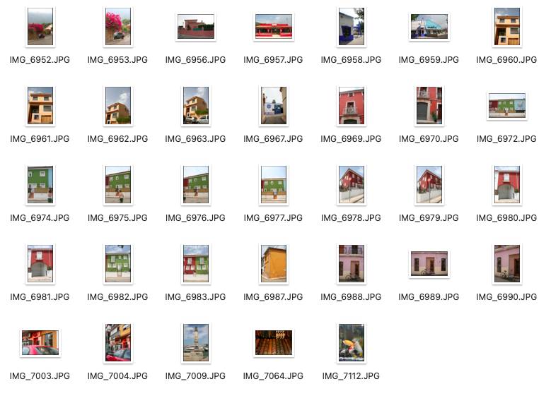
These photos show an array of buildings and things which entail the strong theme of vibrancy and bright colours in Spain. The Spanish architecture is very recognisable, having a range of bright, bold colours which really capture your attention. I'm satisfied with the photographs which contain two things that share the same colour, especially the mauve, light purple Spanish house with the matching coloured bicycle.

|
|
|
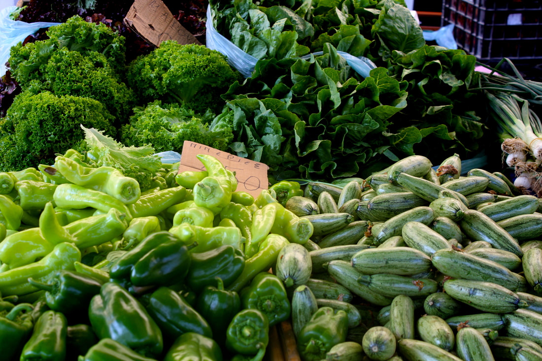
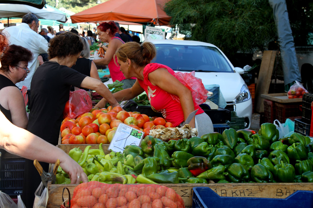
The food market was especially suiting to take photographs of. I was drawn to the bright attractive colours and with my camera I took a range of different photographs of the vibrant fruit and vegetables. I altered the saturation and vibrance of the photographs on photoshop which made them stand out. I was satisfied with the quality of my photographs and the bright colours that it managed to capture as they add visual interest. Next time I would take more close up photographs to capture intricate details.
NEGLECT
pinterest idea board:

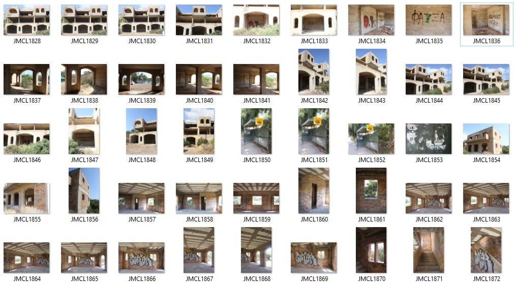
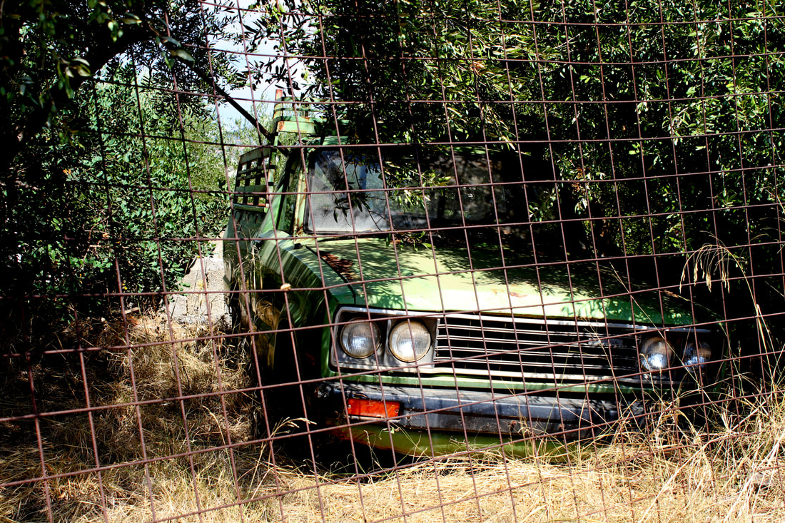
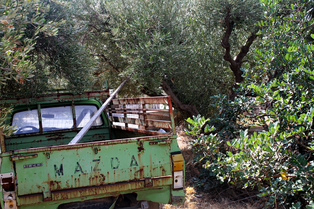
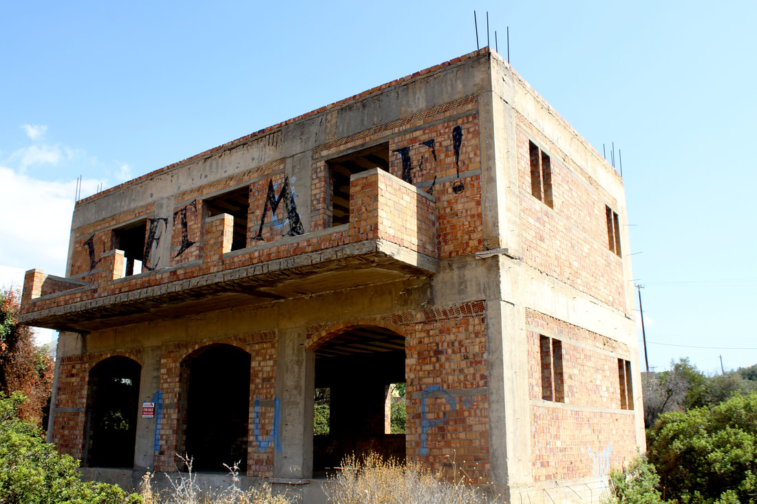
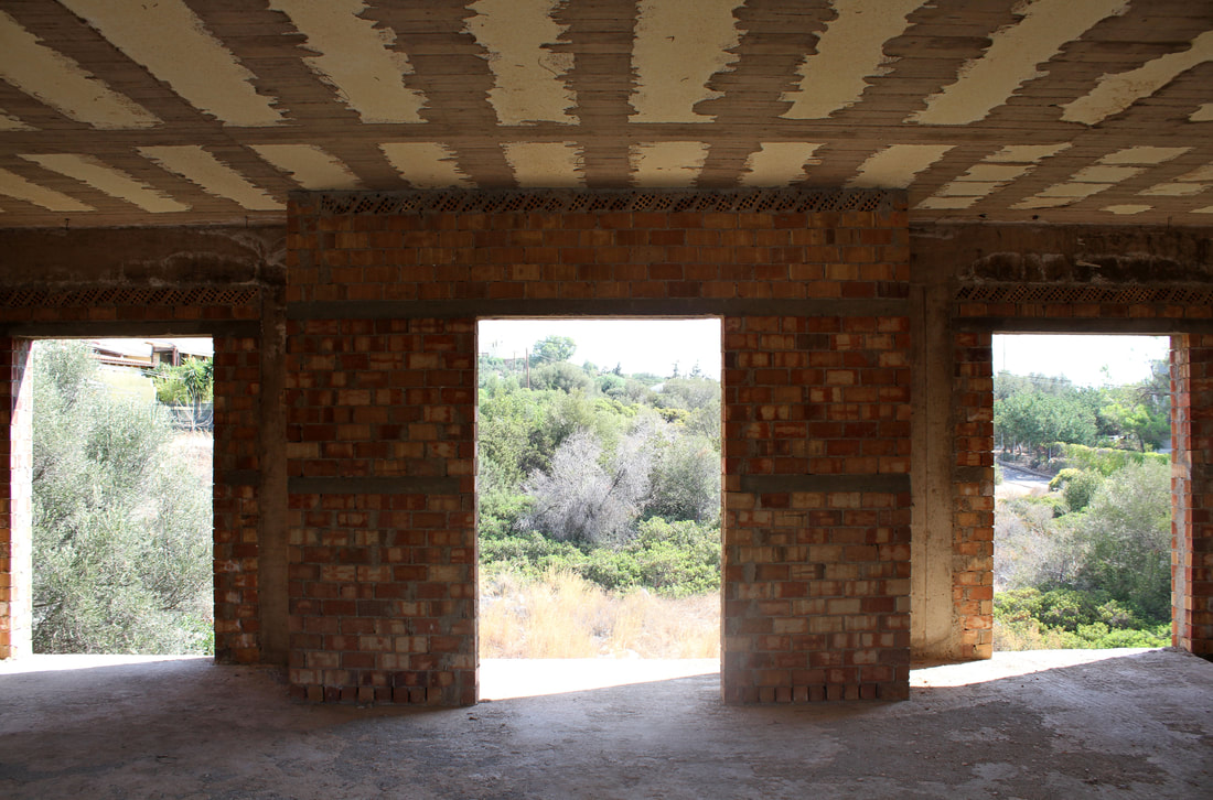
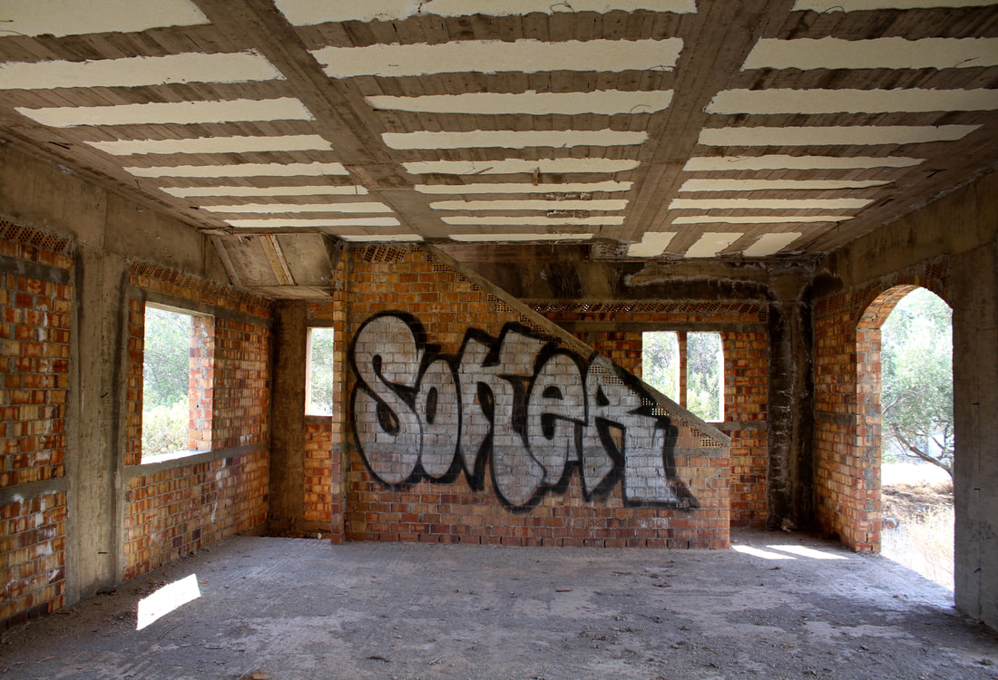
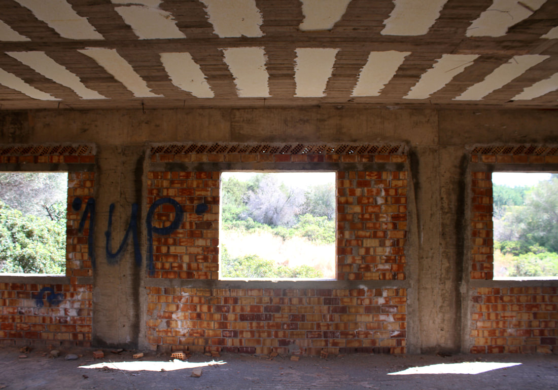
I chose the theme of neglect as the idea of abandonment of cars and buildings intrigues me. Photographing abandoned buildings and cars allows viewers to reflect on the process of time going pass. Abandonment and neglect often have plants growing through them or they show textural signs of deterioration which can be visually striking to the eye. The juxtaposition of natural and man-made elements are intriguing as it shows nature trying to takeover. In Greece, there are a lot of buildings that have been started but are incomplete maybe as the people planning to build a house ran out of money while it was being constructed. The leftover building has graffiti inside accentuating how it's lost and been taken over and vandalised.
|
|

|
|
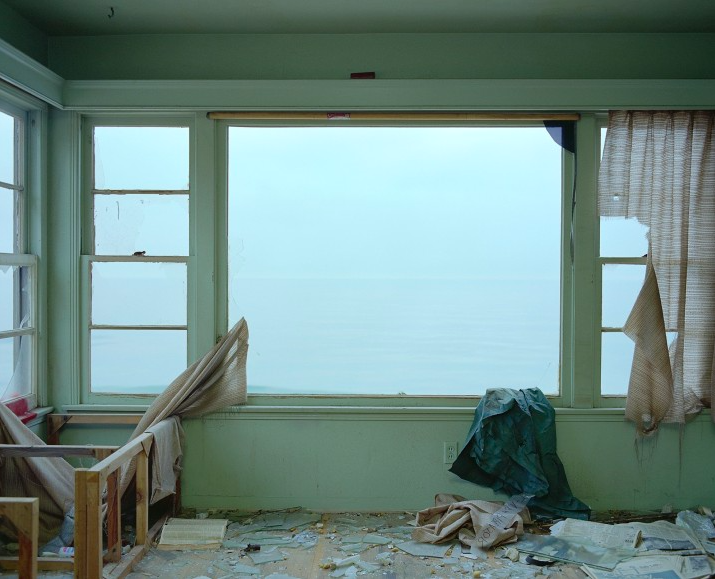
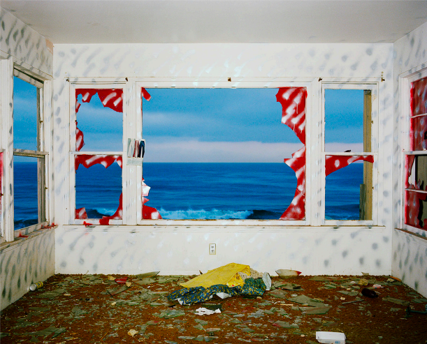
I found a neglected rusty car that nestled in the dry grass behind a fence. It appeared that it hadn't been used in a long time and so it's state grabbed my attention. Along with the car there was this desolate brick, cubed building near which stood in isolation. It had gaping holes in the front and cut out windows in the back. I was drawn by the graffiti wording spelled out on the front. I went inside the building on the ground floor and upstairs taking photographs of the interior and the landscape showing through the windows. I'm satisfied with the outcome of these photographs and I admire the quality. To further develop them, it would be interesting to have taken these photographs on film and used them in the dark room.
JOHN DIVOLA
|
|
|
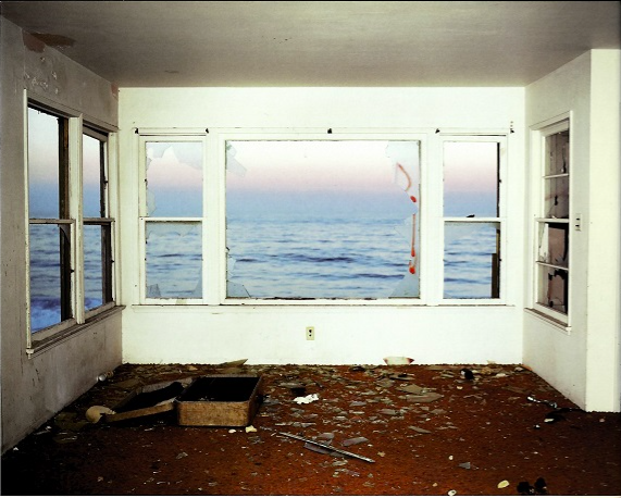
Californian artist John Divola in 1973, began the first of three highly ambitious and original bodies of work that form the series "Three Acts". His "Vandalism" series comprises black-and-white photographs of interiors of abandoned houses. John Divola would enter these places illegally, and then he would spray-paint markings that referenced action painting as readily as the graffiti that was then becoming a 'cultural phenomenon'.
my interpretation:
|
|
|
These photos, show a series of abandoned buildings left untouched. The use of open doors and windows links to the photographer John Divola with his series 'Zuma' and 'Three Acts' showcasing a wide shot of vandalised windows in an abandoned house. The vandalism is also shown within this abandoned house I found in Crete links to Divola's work although Divola vandalised his area himself. I'm happy with the outcome of these photographs as you can see how they are inspired by Divola's work and how they show the rural landscape outside of the windows. To improve these photographs I probably should have found a way to focus more on the environment and less on the brickwork.
MOTION
pinterest idea board:

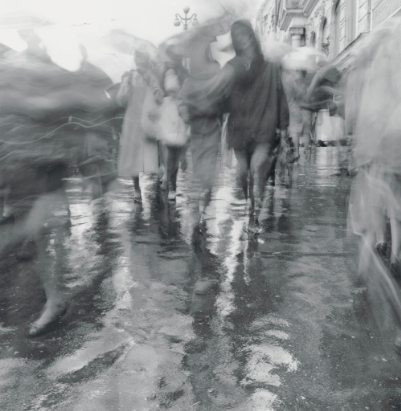
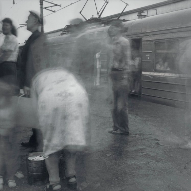
ALEXEY TITARENKO
|

|
|
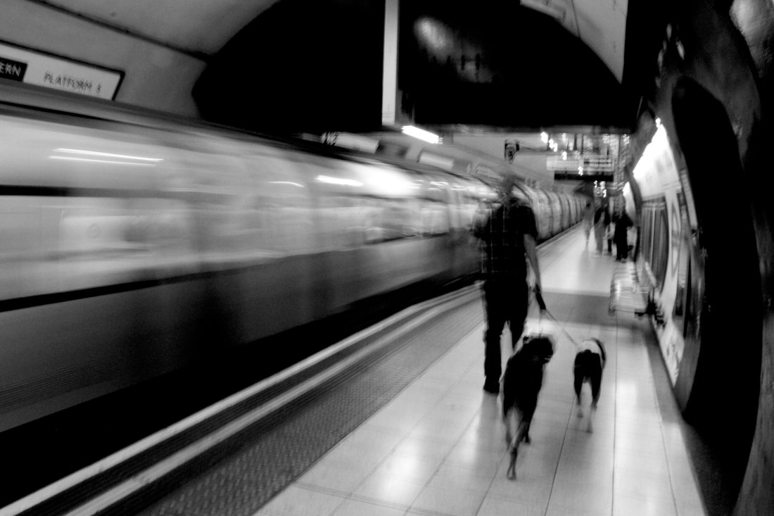
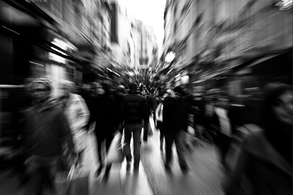
Russian photographer Alexey Titarenko was born in St. Petersburg in 1962 and started taking photos at the age of 9.He received a degree in photo-journalism at the age of 16; and the successes kept on coming as in that same year he became a member of the independent photo club and in 1983 he received a masters in Cinematic and Photographic Arts. His series city of shadows (1991-94) which is the one I focused on; the idea came from the collapse of the soviet union and the transformation of the people around him. The people that surrounded him looked like lost souls, wandering hopelessly scavenging for food. His degree in photo journalism helped out as he had a strong desire to communicate these sufferings to others through photography. He set his camera up in bus stations often near stations and took long exposure photographs of the people rushing in and out, capturing their movement which is portrayed in his photos.
unedited photos:
|
|

|
edits:

|

|
|
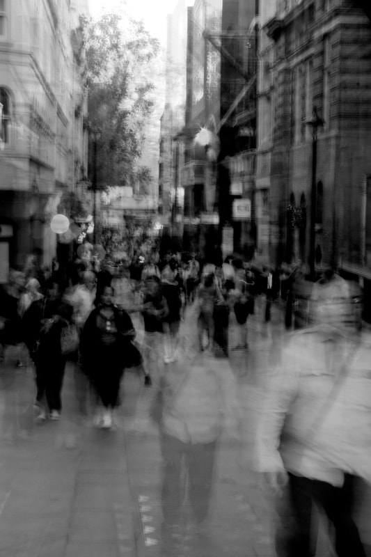
For these photos I went into public street areas and around underground stations attempting to take photos with a long exposure however this was quite difficult in a bright environment, as the photo would be too exposed with a slow shutter speed. However, I found that going into slightly dim alleyways it allowed me to lower the shutter speed giving the illusion of ghosts and transparent figures in response to Alexey Titarenko's work.
Development 1 of motion
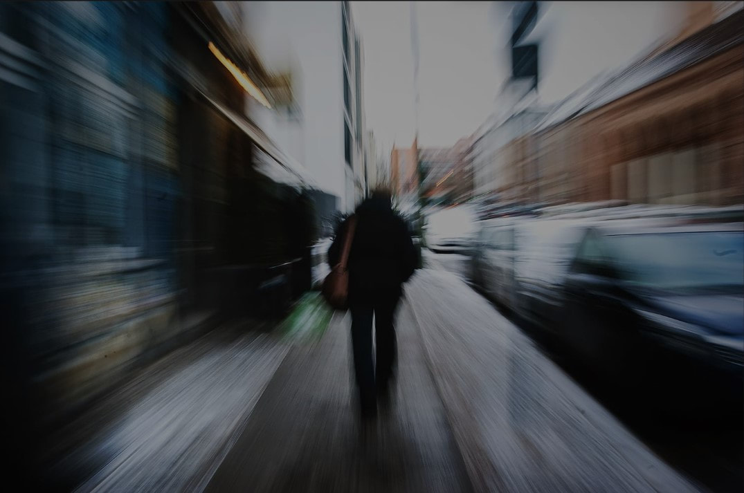
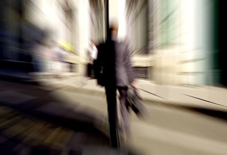
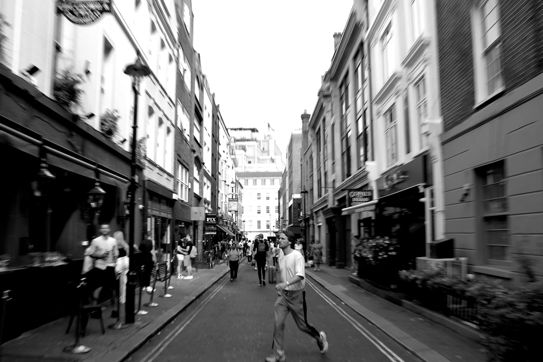
ZOOM BLUR
|
|
|
With this strand I will be attempting to create this zoom blur effect by turning the lens on the camera which creates this dizzy un-natural result. The zoom blur develops this movement and a sense of motion within the photo. This can also be gained by using a slow shutter speed while zooming in when taking the photo while simultaneously having a focus point.
unedited photos:
With these photos I experimented with zooming in while simultaneously taking a photograph managed to do this by finding a focal point and turning the lens. Turning the lens this creates this movement and motion within the photograph and focusing on a particular thing.
edits:


|

|
I think that these photos worked well, however, next time I would want to experiment more with focusing on a singular person while also keeping the camera still as I felt I struggled with camera movement as I probably only needed to turn the lens and potentially alter the shutter speed. I think the ones in colour are more interesting, especially the vibrant red colours that come through from the china town photos.
BLUR WITH A FOCUS

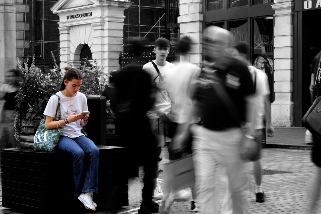
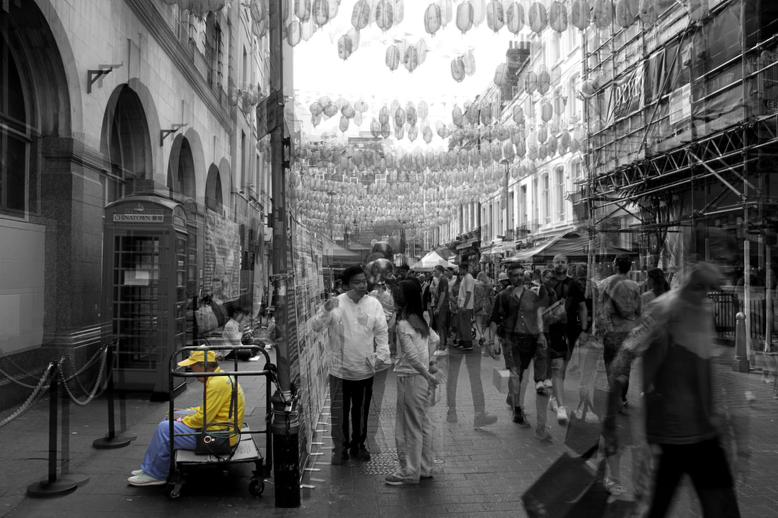
For this strand, I'm going to use a long exposure but use a subject to focus on making sure they make little to no movement yet everything around it moves making noise and fogginess. The subject I'll be keeping in colour yet it's surroundings I'll be discolouring turning black and white. This makes your eyes drawn particularly to the still, coloured subject in the photograph. This evidently is quite an effective technique for really drawing out the subject.
unedited photos:
edits:

|
|
I was influenced by the idea of having something with clarity within a blurry photograph. I went to Chinatown and experimented with using a long exposure, capturing movement while focusing on someone still while everyone else moves. I edited these photographs in photoshop, and to accentuate the clarity of the still person I made the background black and white and edited the person in colour to really grab the attention of the viewer. With these edits having the specific individuals in colour it really draws your attention to the still and almost isolates them. I chose to leave the rest of the photo in black and white with the busy moving background as it really accentuates the colour making it stand out. I used a slow shutter speed when taking these photos, balancing my camera
Face Distortion
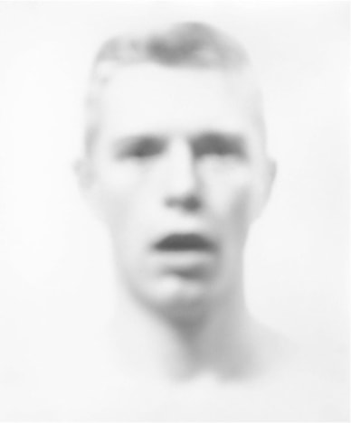
BILL JACOBSON
|

|
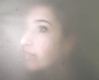
Bill Jacobson takes these bleached out of focus pictures which are quite defocused. To take these abstract portrait photos we used coloured gels and paper creating these colourful scenes getting your subject to stand behind a frosted tracing paper creating this glow. By making your subject place their face against the tracing paper their face appears more.

|

|
|
SEUNG-HWAN OH
Seung-Hwan Oh was born and raised Soul where he now lives and works until he moved to New York where he studied photography and film. He was influenced by science and philosophy. He distorts his photographs in the series "Impermanence" inspired by the second law of thermodynamics (the idea that all matter including all the life forms collapse).He cultivates fungus and applies it to his film before he take his photos bacteria which erodes the material of the photograph almost eating and decomposing the photograph. He uses film and bathes it in water and homegrown bacteria for months some even years, blending the organic and artificial damaging the photo.
His photos appear distorted and discoloured showing what is visible and what is lost under the distortion.
His photos appear distorted and discoloured showing what is visible and what is lost under the distortion.
first attempt :

|

|
With these photos I used some photographic paper but the inks weren't as reactive as the ones that you can get printed from a store.What i achieved was a difference to the original photo as the bleach brought out a rusty colour on the jacket and distorted the face, however to improve this I went to snappy snaps where I got a new set of photos printed out.
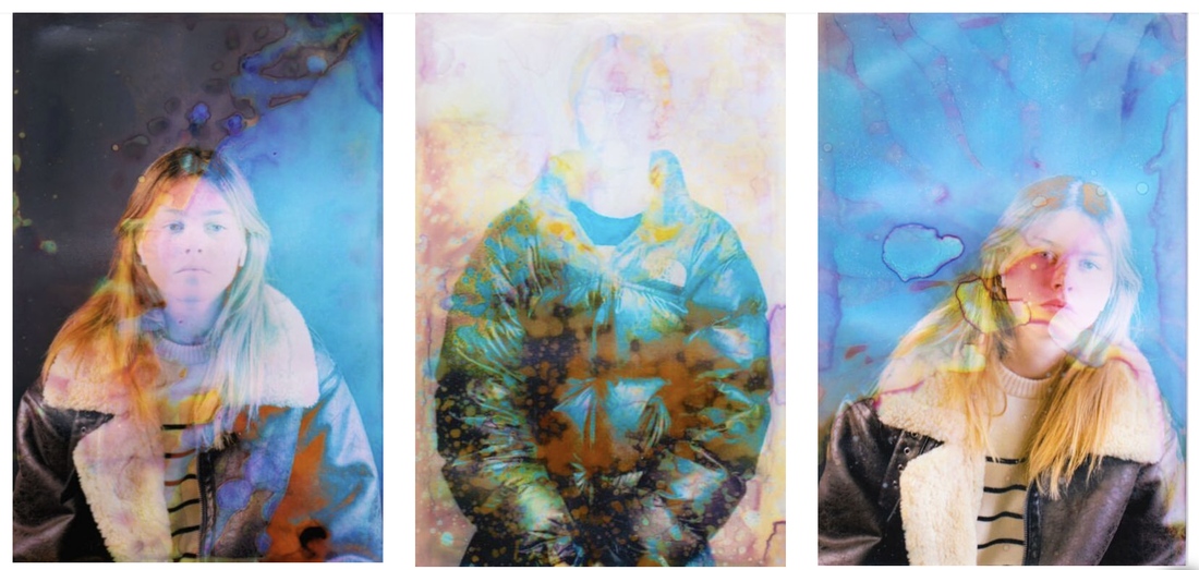
To get this distorted affect I printed the photos at snappy snaps then applied neat bleach onto a paint brush and applied it to the photo as the bleach took place and lightened the photos.My aim was, like Seun-Hwan Oh's photos create a distortion by fading my subjects facial features resulting with a blur of abstract colours. The bleach accentuates the colours of the ink and with the middle one I used a Jackson pollock style affect by spraying the bleach on.
VALERIE KABIS
|

|


|
Valerie Kabis is interested in how shadows and shapes are created by limiting light. By experimenting with light, shadow and variations in focus, Kabis creates a series of dark and thought provoking images. The series above is called 'Faces'. Through manipulating aperture and at times over-exposing her images, Kabis evokes a sense of deep emotion and reflection through her photos. Her photos within the series 'faces' which contrasts with her 'excited light quakes' that feature in her works which symbolises hope and brightness in what Kabis describes as the 'unquiet void' which is the world itself.
first response:
unedited photos:

edited response:
|
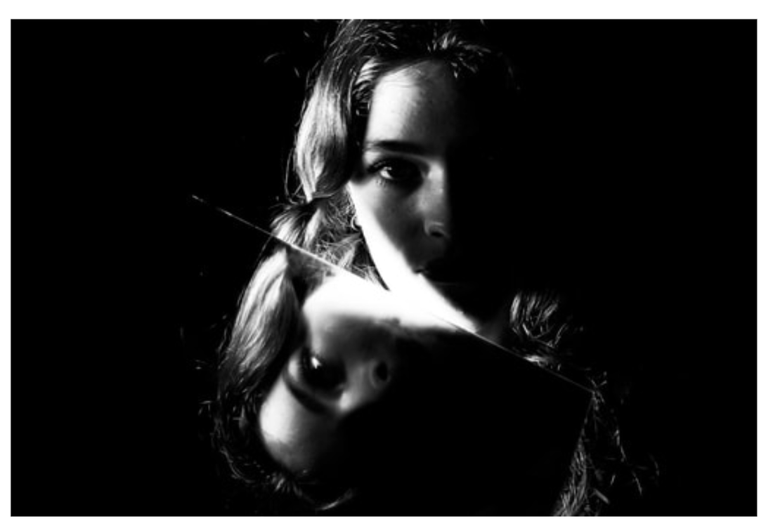
|
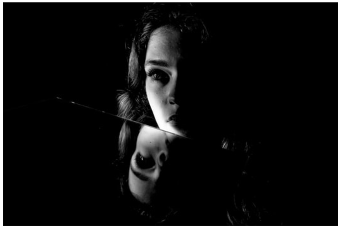
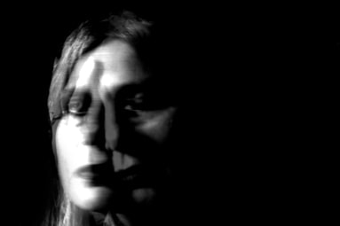
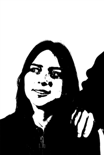
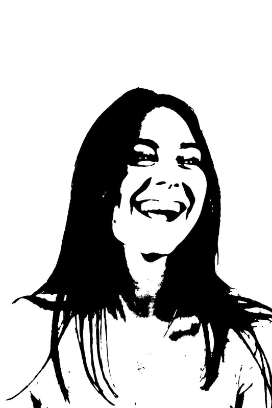
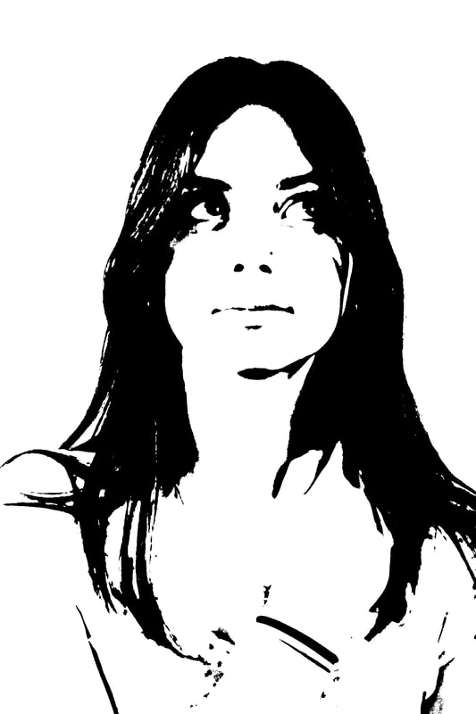
The first set of pictures where taken with a digital camera. I experimented with the shutter speed and using the object of a mirror which I thoroughly liked. The mirror gave the impression that the photograph is cut in half which creates the double exposure of my subjects face. However, the photographs appear quite clear and motionless, so with my next development I want to capture more motion of my subjects face. With the inspiration of Kabis' work, I edited the photographs on photoshop, making them black and white and adjusting the contrast which makes the white tones brighter and black tones darker.
improved response:
unedited photos:

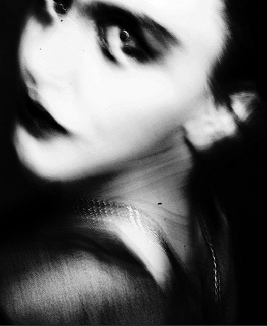
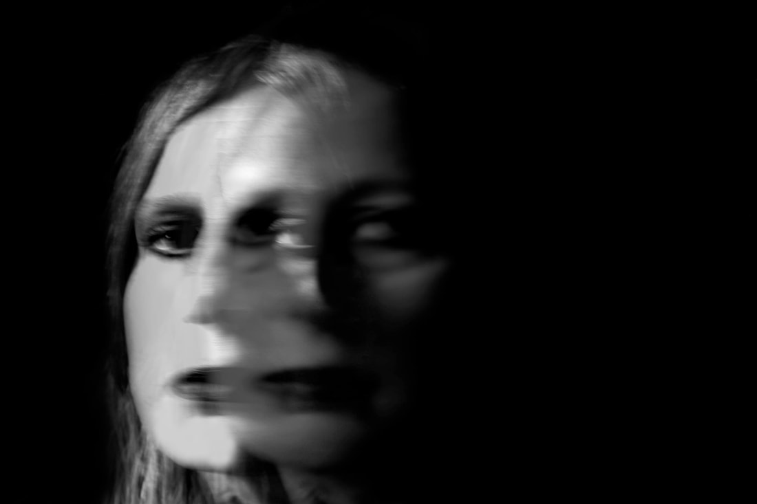
When taking these photographs, I photographed my subject against a dark background and experimented with natural light. I used dark makeup such as eyeshadow and eyeliner along with a dark lipstick to accentuate her features and add to the juxtaposing darkness of the photo, contrasting with the light tones.
edited:

|
|


These photos came out well in response to Kabis's series , I edited them in Photoshop and altered the exposure, and exaggerating the contrast while removing the colour and putting it in grayscale. I also experimented by layering photos over each other and changing the opacity giving it this double exposure look linking to the topic of motion.Next time what I would do is try to capture the photos by using a long exposure giving them the double affect.
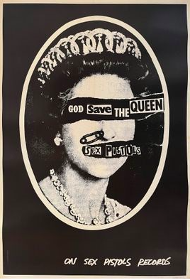
CLUNIE REID
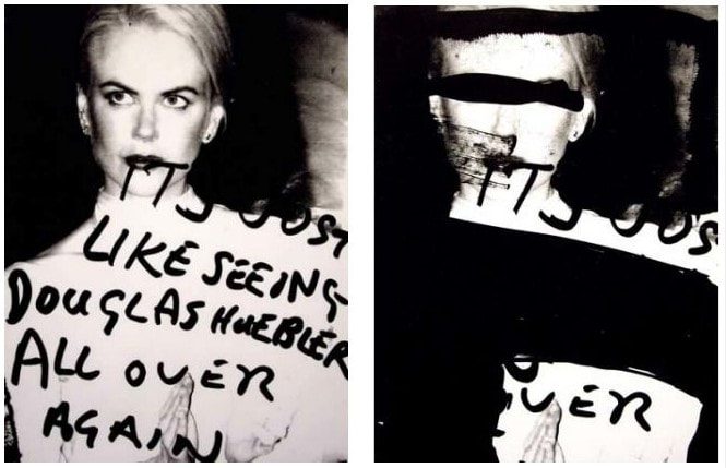
Clunie Reid is an artist who currently works and lives in London. Her work is very thought provoking. Inspired by 70s punk artists such as Jamie Reid and Linder. Magazine adverts are Reids most he focuses on bold subjects such as sexual representation and violence in capitalist culture .She explores identification and feminine representation. The bold, graphic letting written with a black marker pen to make statements to highlight how cliché and staged they are .She creates collages from advertisements, newspapers, television shows along with found objects in her images along with hand drawn marks she eventually re-photographs them and re-prints them in black and white.
Reid was asked to name the single most important item in her studio and without hesitation said 'my scissors'.She deliberately uses cheap materials which contrasts worth her expensive looking pieces.
Reid was asked to name the single most important item in her studio and without hesitation said 'my scissors'.She deliberately uses cheap materials which contrasts worth her expensive looking pieces.
unedited photos:

|

|

|
These photos are my first attempt at experimenting with colour gels, layering normal printed photos writing on tracing paper with a sharpie and layering the text over the image. The writing I used I found from a quote about sexual harassment which links with the recent allegations of Russell Brand.
unedited photos:

|

|
For this development I printed out a photograph of my work on acetate and layered them over each other creating that double exposure effect of the left hand
side. I wrote some wording over the top of the acetate page, from a quote I found from a feminism protest banner. The theme of women is explored throughout my work such as how they are perceived in media.
side. I wrote some wording over the top of the acetate page, from a quote I found from a feminism protest banner. The theme of women is explored throughout my work such as how they are perceived in media.
CLUNIE REID AND JAMIE REID DEVELOPMENT

|
|
I took a new series of photos for which to use in the dark room. At first, I invert them in photoshop and then print them on acetate.
unedited studio photos:
Firstly, I edited the levels on the photo, adjusting the contrast. I turned the photo black and white then through adjustments I inverted several photos and then got them printed off on acetate. By printing them on acetate and inverting them it will further allow me to use them in the dark room on light sensitive photographic paper. Layering the different photos, magazine articles and lettering I produced inspired Jamie Reid's punk sex pistols work to showcase in the darkroom where i would experiment with light
Inverted magazine photos photos:

|

|
Lettering inspired by artist Jamie Reid:

|
|
Photographs from earlier Kabis response:

|
|
darkroom results:
|
|
|
|

|

|
|
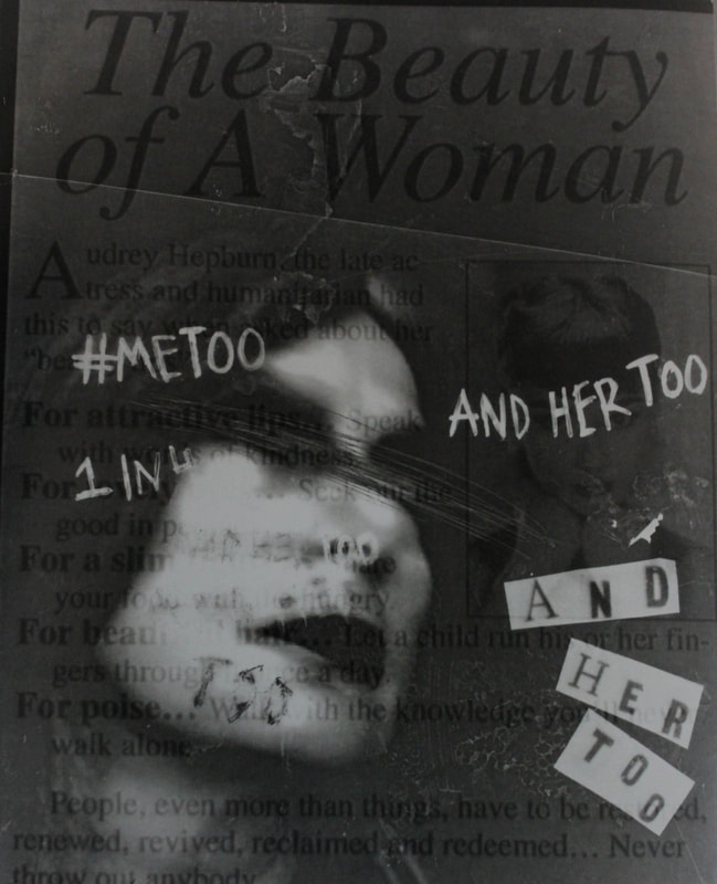
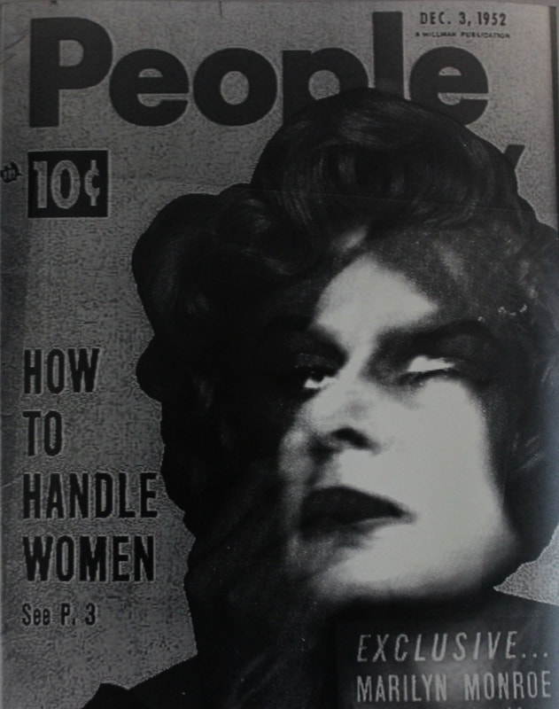
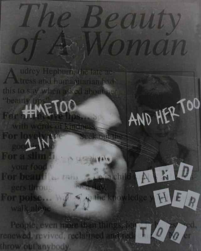
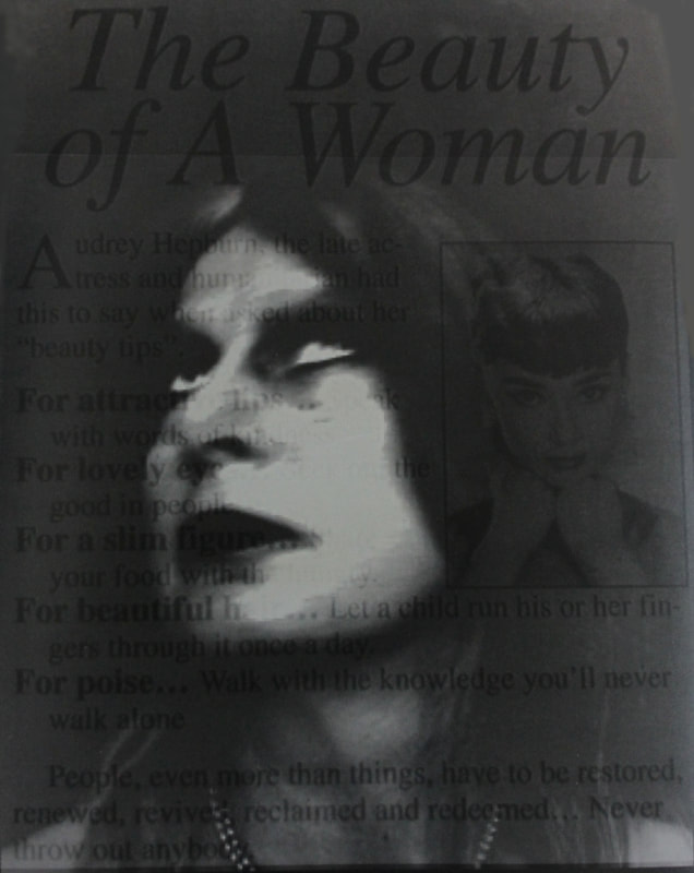
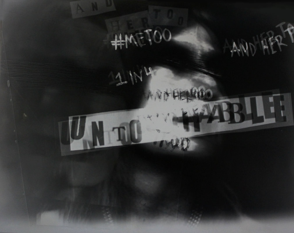
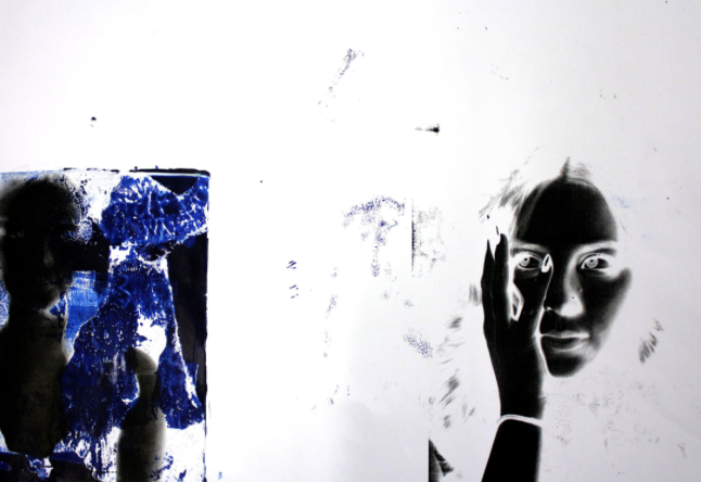
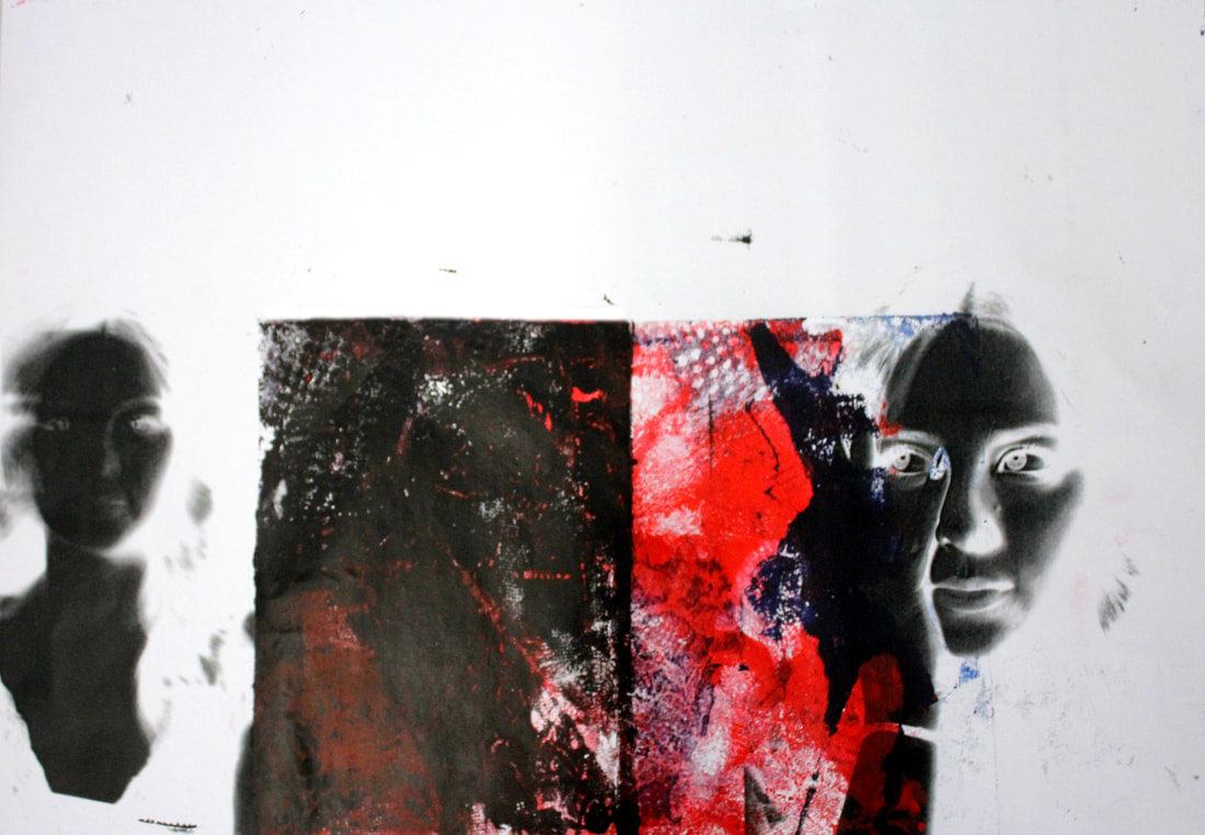
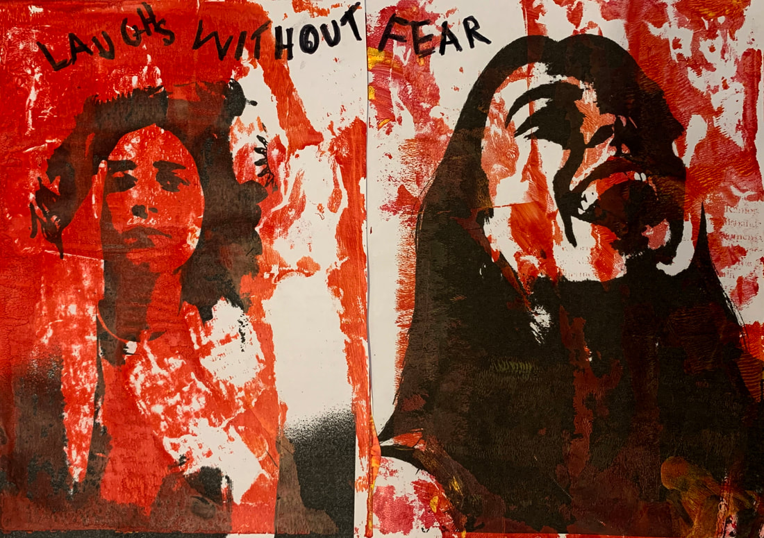
With these, I layered the different photos that were printed on acetate and I cut out the words and layered them on top of each other, exposing the different layers for different amounts of time making some stand out and some fade. Positioning the writing and Jamie Reid inspired text over the face and mouth, almost silences the subject in the photo, implying the silence of victims of sexual harassment victims. The wording also relates to the Me Too movement, which is a social movement and awareness campaign against sexual abuse.
The dark black really juxtaposes the white of the wording and the subjects face really making it stand out. The Marilyn Monroe and Audrey Hepburn magazines of relevant wording links to the theme of the movement and I think that layering the text over the paleness of the subject really works. Next time to improve my result I would write more around the subject and scratch more of the blackness reducing the empty space.
The dark black really juxtaposes the white of the wording and the subjects face really making it stand out. The Marilyn Monroe and Audrey Hepburn magazines of relevant wording links to the theme of the movement and I think that layering the text over the paleness of the subject really works. Next time to improve my result I would write more around the subject and scratch more of the blackness reducing the empty space.
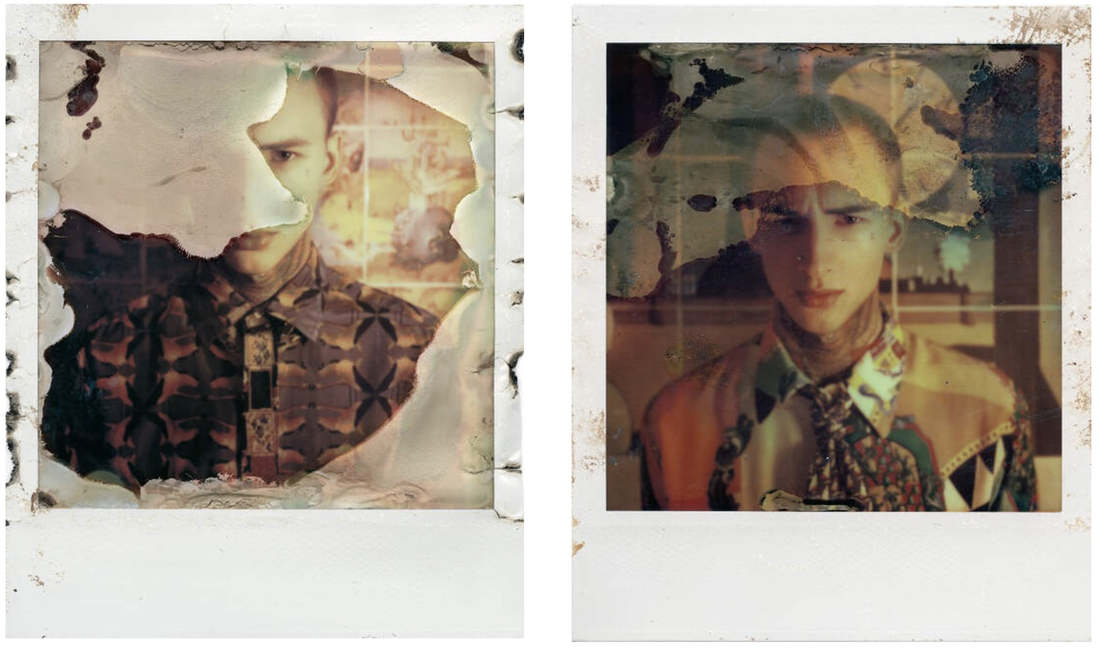
DEVELOPMENT : OLIVER BLOHM
Blohm is a Berlin based photographer that focuses predominately on the manipulation and experimentation of portraits. He discovered from the early age of 9 when he moved with his family to a small village that he was fascinated in photography due to the fascinating environment around him, such as forests, fields and old factory buildings. Later on in his life he got recruited as a fashion label and he discovered that there is more than just commercial fashion photography. This is why people became his focal point as a photographer. Fascinated by the most important visual focus point of a human body: the face, he took polaroid's then developed them using an old microwave know as his 'Impossible project'. As a result of this it leaves the film distorted and adds interesting discolouration, burns and texture.

|
|
unedited photographs:
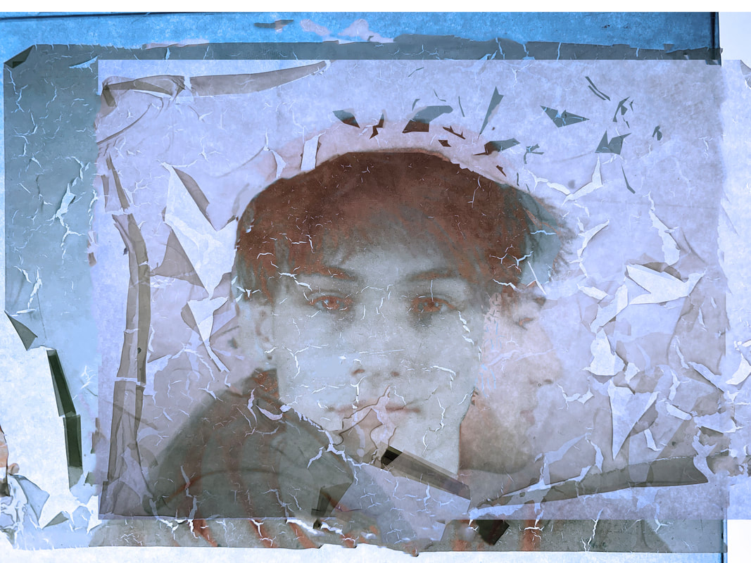
For this development I took a series of photos some with artificial and natural lighting and also different angles and printed 9 of these images out .Then I experimented with them by leaving them in bleach and water for a certain amount of time.
The bleach and water fades the picture and if left in the mixture for enough the film starts to peel off which distorts the photo and takes away certain elements of the photo.
The bleach and water fades the picture and if left in the mixture for enough the film starts to peel off which distorts the photo and takes away certain elements of the photo.

Edited Images:


|


|
GELLI PLATE MONOPRINTS

|

|

|
|

|

|
|

|
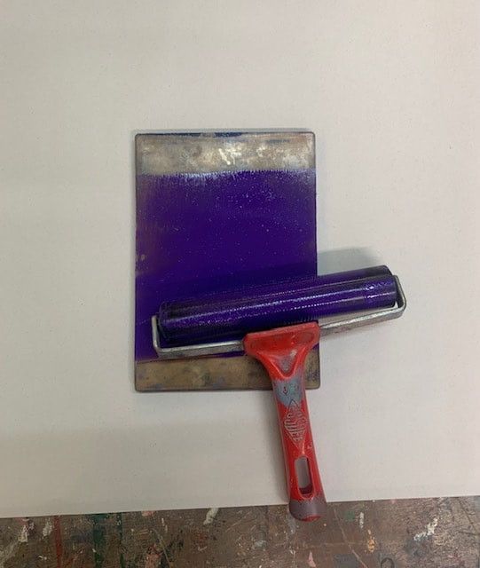
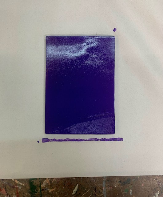
For these Gelli plate prints, I used acrylic paint and rolled it on the gelli plate creating a thin layer. With the torn fragments from a few Vogue magazines that I selected, I stuck them face down horizontally on the paint and pressed firmly, after a few minutes I would peel the magazine back and if I wanted another colour apply that over the top with a different roller. By using textured fabric such as lace, pressing them down over the paint it creates this patterned affect. Quickly before the acrylic paint dried out, I pressed my selected image with the intent of printing it on and used a blow dryer while simultaneously rubbing the paper on the gelli plate. After a few minutes, I began to slowly peel the paper away from the plate and it produced this effect shown on the photos.
To improve my outcome, next time I would make sure not to apply too much acrylic paint and to not leave it long enough so that it cant dry before applying the paper. It's quite a time consuming process, especially as you have to clean the jelli plate between each print. However, I'm definitely satisfied with my outcomes, I especially admire the ones that use two colours, and you can easily see the magazine print. For my next develeopment im
To improve my outcome, next time I would make sure not to apply too much acrylic paint and to not leave it long enough so that it cant dry before applying the paper. It's quite a time consuming process, especially as you have to clean the jelli plate between each print. However, I'm definitely satisfied with my outcomes, I especially admire the ones that use two colours, and you can easily see the magazine print. For my next develeopment im

|

|

|
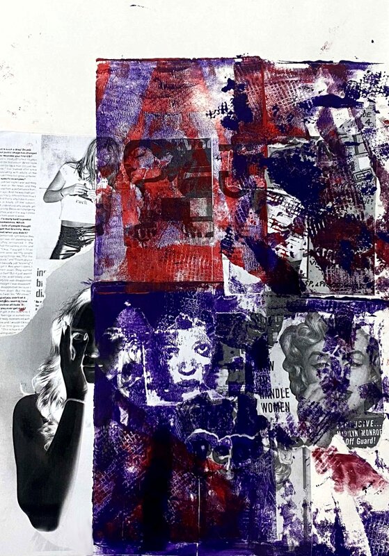
With this piece, I used the same effect by using a gelli plate. I did four prints using a similar colour scheme including purple and red. Instead of printing directly onto my subject, I printed specific magazine photos out, tore them and pasted them together creating a collage. The magazine photos all relate to how women are depicted in the media and through magazines. I still included the photo of my subject which is emerging from the background
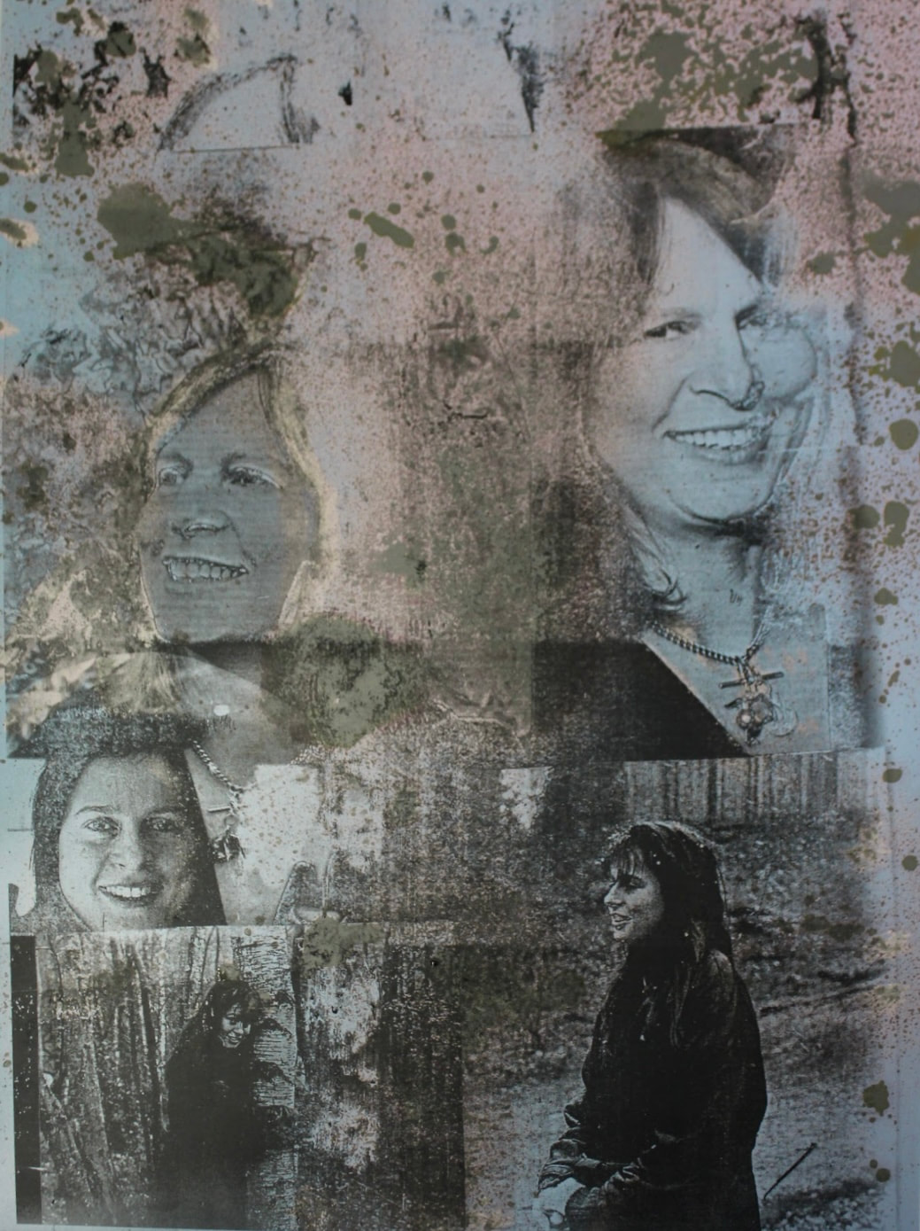
RITA KEEGAN
Her work explores memory, history, dress and adornment, often through the use of her extensive family archive – a photographic record of a black middle-class Canadian family dating from the 1890s to the present day.
Rita keegans works explore family history, memory and identity. 'A lot of it came out of a feminist perspective working in the 1970s and 80s of putting yourself in the picture'
Keegan owns an extensive archive of photographs of her Black middle class Canadian family from the 1880s onwards. Keegan photocopies these images to create colourful monoprint collages.
I came across Rita Keegan in the 'Women in Revolt' exhibition at the the Tate Britain. I was instantly drawn to her work as it appeared similar to the gelli print process I used of overlaying photographs. The vibrant primary colours really stand out and juxtapose the dark black of the paint. I likes the expressive faces and clarity of prints, so with my next attempt I'm going to take new photos and try to fix my technique to improve my prints.
DEVELOPMENT
For this development I was thoroughly inspired by the works of artist Rita Keegan and so I decided to make more gelli prints. I took a set of expressive portrait photos of my subject in the photography studio behind a white background. I wanted to experiment with the identity of women and link it to my earlier work in response to Clunie Reid.
unedited studio photos :
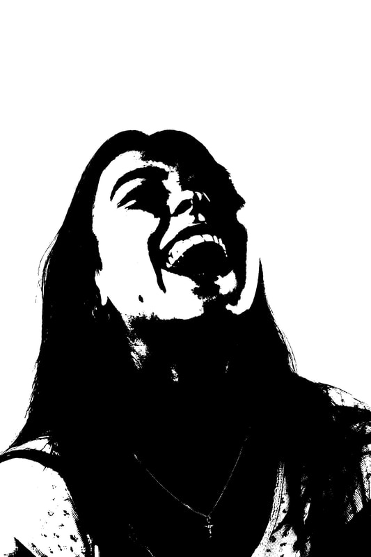
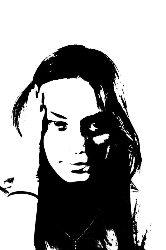
For this set of photographs, I selected an appropriate group of pictures and adjusted them altering the contrast and then selected image and threshold and it turns the images into a high-contrasting, black and white images. You alter the ratio of dark black which concentrates on shadows to pale white creating a sharp and clear picture.
|
|
|
|

|
|
With these photographs I printed them off and used them fof my gelli plate prints. The dark blacks contrast well with the bright colours and the pure whiteness of the paper picks up the colour well. I decided to stick to a key blend of two colours being purple and yellow. I then stuck my prints together in a line.
process:
|
|

|
Evenly distribute your chosen paint colour/colours onto your gelli plate with a hand held roler. Then with your selected magazine articles, place them directly onto the plate and press them down with your fingers. Peel the pictures back and if successful the ink would have reacted on the plate and removed the paint in certain areas. When happy with the outcome place your paper on the plate and press firmly, rubbing the back of your hand across, making sure it's picking up the paint. You may use a hair dryer to speed up the process. After a couple of minutes peel back your paper and the acrylic paint should have stuck to it.
|

|

|

|

|
I feel these prints are effective, experimenting with different acrylic prints and I think the colour palette of paint worked well. The gold tones create highlights. The writing over the prints relate to the theme of women, I used feminist quotes from protest which I think where quite effective. However, next time I would try and improve the clarity of the magazine prints so you can see the article I attempted to press.
DEVELOPMENT
I wanted to take a more personal approach, so I found vintage photographs of my mother pre 1990's.
Photographs of my mothers youth:


|


|


|
first set of un-edited photographs:

|
|
Black and white edits:

|

|

|

|
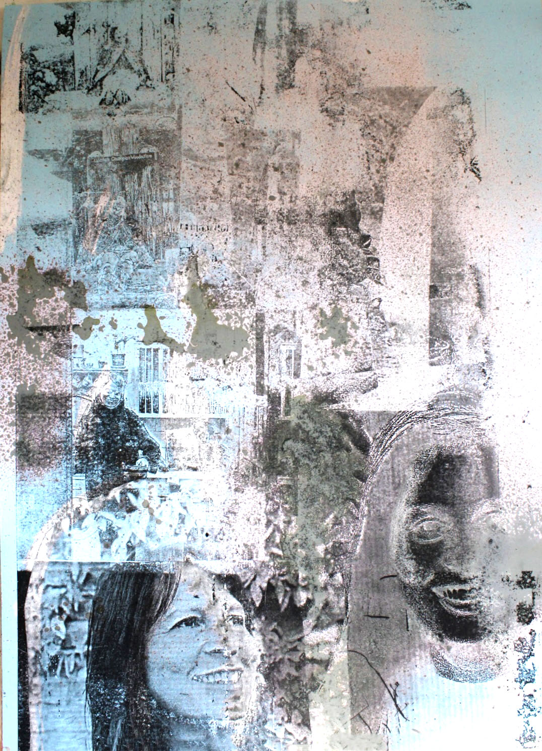
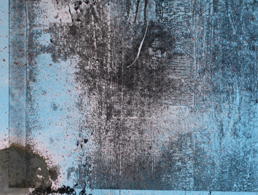
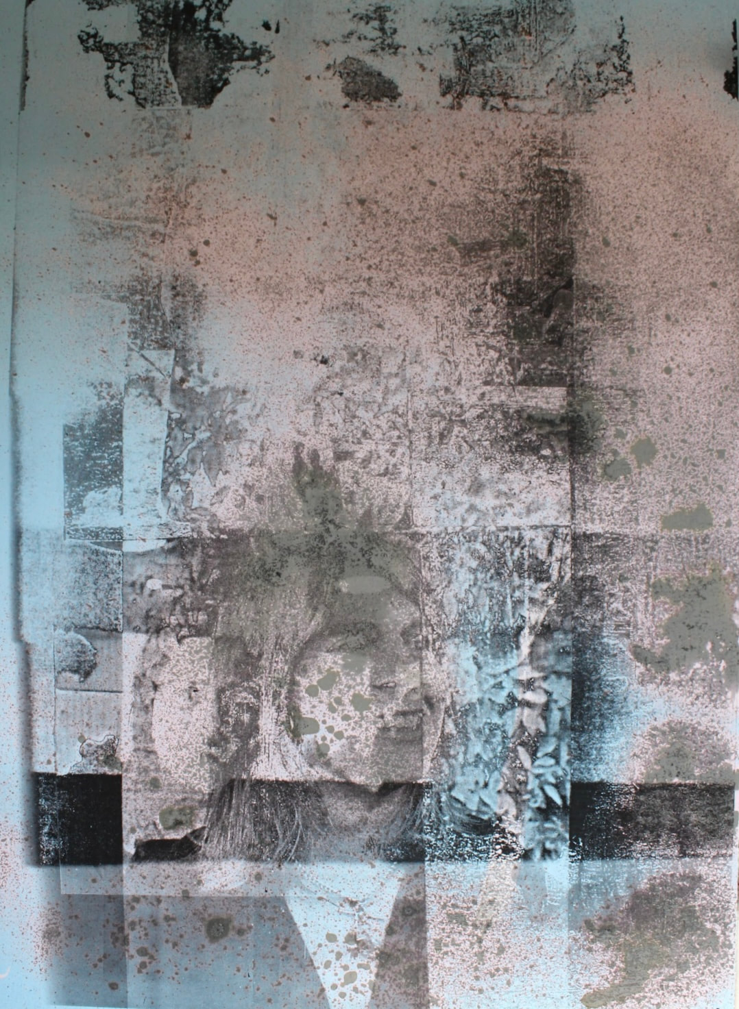
FINAL DEVELOPMENT PIECES
The images below were created by printing my collage which where layered on top of each other. This collage of photographs was printed onto acetate and over layered and I used in them in the dark room. I then printed my dark room edit onto blue photographic paper. I think the overlapping of the images of my mother is effective and it shows memories in her life overlapping and interlocking with each other. The blue tones are intriguing, I think my edits are effective in portraying memories. I sprayed a fix solution over the blue photographic paper and it reacted creating this spray effect produces this interesting look.
Process:
|


|
